Wednesday 14 September 2016

Iron Viz - Device Designer

Tableau Public recently announced the last of the three entry contest for the 2016 Iron Viz, so I thought I'd have a crack!

Update: all entries are now up here and if you like mine you can vote by tweeting #MobileIronVizpgilks

This contest was a bit different from others because the instruction was not based around a data topic but instead you need to show that you have used the new Device Designer feature, and design a single dashboard that work on both mobile and desktop - and the data topic is open ended!

I found this contest much more of a challenge to get started with than previous contests. One reason was the open ended question of what data set to use - where do I even start and what hasn't been done before? When I enter a contest like this I like to try and do something completely original, but the Tableau Public library is becoming crowded, especially with things like Make Over Monday happening, and it can feel like the number of unexplored datasets is quickly diminishing.

After much handwringing I decided to go back to an idea that I had ages ago, back in 2013, just after I made this viz about the tallest buildings in New York. And that was to do something about the most extreme roller coasters in the world. So I thought I'd revisit this topic, and at the very least if it didn't win it would scratch a long standing itch. I don't have as much time for Tableau Public as I used to and so its nice to use the time for something I have had on the to-do list for a good while.

The other tough bit about this was using the Device Designer to make a mobile friendly dashboard as I haven't done that before and needed to get used to the new feature. I learned a few things about it which I'll detail below.

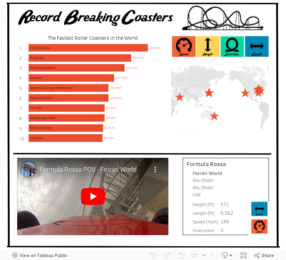
Below is the finished design - you might note that its pretty simple, and this is purposeful. I wanted to challenge myself to see if I could make an engaging dashboard that could fit onto a single phone screen without scrolling. My thinking here was that, to put it bluntly, most people can't be bothered to scroll. And scrolling with interactive dashboards can sometimes cause click confusion. Of course in order to achieve a single screen view, it needs to be very simple and pared back.

Of here's a screen shot of the mobile version and the desktop version, and an interactive version is below. This will change depending on how you are viewing this blog!


Data is sourced from rcdb.com

!!! Update: I just tested this blog post on my phone and the viz below looks all screwed up, please click this for how it should look if you are browsing my blog on a phone 


So what did I learn making this viz?

1. Keep things (even more) simple

I'm a big fan of simple straight forward design in Tableau, but with mobile you have to taker that to another level. A couple of tips that I took from Dash Davidson's blog post were to ensure I lock my map and to use only actions as filters and avoid quick filters and other drop downs. Drop down menus can obscure everything on mobile so are best avoided. I also tried to keep my sheet arrangement simple so I could be sure it would look consistent across different platforms, and to avoid potential confusion brought in by things like hidden sheets that pop out.

Tooltips are also hard to use on mobile because of the space constraints and so I limited these to only the bar chart and used highlight labelling instead on the map.

The challenge of keeping things really simple actually turned out to be quite worthwhile - it's easy to get carried away building fancy things in Tableau almost for the sake of it. The restrictions of designing for mobile focus the mind on what's really useful. I have even more respect for app designers now!


2. The order that you make things with Device Designer matters, a lot

In my first attempt at this viz, I went straight to the 'Phone' setting on the Device Designer and designed a viz that would look good on a phone. The thinking here was to design 'mobile first' as mobile is these days the primary route to the web, and because the contest was introducing a mobile component.

The difficult thing about this was what happened when I tried to take this as the basis and go and build out a desktop version.

The rookie mistake I had made was not to build the 'Default' dashboard first, and so everything I had done on the phone version was not there for other versions and I had to try and build things back up from scratch. I got pretty confused with the workflow and ran myself around in circles.

Eventually I decided to scrap my efforts and start again. This time I designed 'desktop first' within the Default view, and then adapt to phone. From a practical point of view this proved to be much easier. But it also meant that everything I was doing I was also having to think one step ahead to 'what will this look like when I switch to phone'.

3. Font sizes are tricky!

Even though a desktop screen can be really big, and a phone screen is really small, your fonts used within sheets are not going to automatically re-size. I wanted big fonts on desktop and small fonts on mobile, but this would have meant making multiple versions of the 'Default' view and would have negated the purpose of the Device Designer. So I spent some time trying to pick font sizes that looked reasonable on both devices.

4. You can't use new sheets, but you can use new objects

The way the DD works, only the sheets in your default view are available to you to use in your device specific versions. So you can't have a 'big bold' version and a 'small simple' version of the same sheet. At least I don't think you can without doing something clever with hidden sheets. I didn't want to get involved in that kind of trickery so I worked within the limits most users will experience.

You can however add new images, text objects and web objects, so this gives you some flexibility with titles and pictures. I tried to utilize this in my viz.

5. You might have even less space than you think - always test the reality

If you are going to make a mobile dashboard, you absolutely MUST test it on a phone. Looking at the view on Tableau Desktop, or using an emulator on your desktop is not going to do the trick. Your mouse pointer is very different from my fat fingers, and scrolling on your magic mouse is a lot different from scrolling with a thumb. If you don't test properly you might be kidding yourself as to how your viz looks and works.

When I opened my viz on my phone I noticed that the visible screen was actually much smaller than I expected because of the extra headers that Tableau Public adds by default. You can get rid of these headers by altering the URL to include &:showVizHome=no, check out the difference between these two links on your phone
https://public.tableau.com/views/RecordBreakingCoasters/RecordBreakingCoasters?:embed=y&:display_count=yes
https://public.tableau.com/views/RecordBreakingCoasters/RecordBreakingCoasters?:embed=y&:display_count=yes&:showVizHome=no


Thing is, you can't guarantee that people will see your viz with the URL changes, so design for the worst/smallest possible scenario. Below is a picture of how my viz looked on Tableau Desktop as per iPhone 6, and then for real on my iPhone 6.


Anyway, I think I finally got the hang of this, I hope my experiences above can help you get a head start on using this new feature. It is pretty cool to finally be able to know that your viz will be able to be viewed on a phone, and the restrictions of size are actually a welcome challenge that focusses your mind on simplicity.

 And I hope you enjoy exploring the worlds fastest, tallest, longest and most upsidedowny roller coasters...


Thursday 21 July 2016

Olympic Medals

Here's another ReViz! This time Alex Duke through down the gauntlet of using Olympic medal data and came up with this Viz of the Day. Also Dash Davidson had asked me if I would help Tableau create some Olympic themed vizzes that could be used for an exhibition. I cheated a bit because Alex's data did not have 2012 medals, so I went and found them to be up to date.

So I decided to go for a pretty simple approach that could be printed out and used as a static image. I've also always been a fan of medal data that takes into account the size of a countries population for context, so I built in a switch to flip between total medals and medals per million people. If you are printing these out, you could place the two versions side by side.


Anyway, here it is:


Tuesday 12 July 2016

Simple requirements gathering questions for dashboard design

Today I gave a bit of a tutorial to my team at work* about how to develop effective dashboards and I included a section on how I like to gather requirements from the people I'm making the dashboard for. I basically have a framework of simple questions, that once complete should give you the bulk of what you need to know to build an effective and useful dashboard.

I thought I'd share a version of it here. Please bear in mind of course that this is definitely a simplification - good requirements gathering is a conversation and entails a good deal of understanding of the subject and data - what I'm focussing on here is simply the content/structure of the dashboard.

So here's what I do, I ask questions. I definitely do not ask 'what do you want to see?' or 'what numbers do you need?' as these open ended questions often lead to over loaded monstrosities that somehow don't get to the heart of the matter. And I don't get people to fill out forms, because that's boring.

Here are some of the questions I ask, and how they can help me design a dashboard. I hope they help you too!


 *did I mention I got a new job? I'm now working in Product Insights at Spotify, yay!

Wednesday 25 May 2016

ReViz - Tornadoes!

I recently joined the wonderful ReViz project with Matt Chambers and Alex Duke, trying to fill the very large shoes left by Nelson Davis.

If you're not familiar with the ReViz project I encourage you to check out the page and see the work that's been done so far.

Matt recently kicked off a new ReViz by taking the Torndao dataset used in the 2012 Iron Viz contest,  which was won by Anya A'Hearn and finding a new story which showed the five deadliest single days of Tornado outbreaks recorded in the USA.

When I got a hold of the data, I have to be honest I found it really hard to come up with another engaging story within the dataset that hadn't yet been covered. So instead I've created something that I hope is more of a striking visual. Taking inspiration from the famous US wind map (see below) I wanted to show visually the volume and power of the tornados and how they are clustered around specific parts of the country.

Wind Map:


I also wanted to show both just how common tornadoes are but also the degree to which fatalities from tornadoes come from a small number of very big instances. I also included some light interaction to let people zoom into their state, or to look at how things change over time.

Unfortunately the resulting map is pretty slow to load, and so to mitigate that a bit I only included the most recent 10 years of data. The result is below:


Thursday 12 May 2016

The Usefulness of Unions in Tableau

Recently in some of my projects at work I've been making use of creating data unions before I bring the data into Tableau for ease of use and efficiency. This topic also came up at a recent NY Tableau User Group and seems to be a popular approach, so I thought I'd write up a quick how to on using 'unioned' data to your benefit in Tableau, with a couple of examples.

Some of this will become less relevant when Tableau introduces cross database joins, and cross data source filters. But none the less it might be helpful for a while longer. It can help a lot getting around issues you may have with data blending, or with one to many joins or with avoiding having to resort to Parameters (which don't update with the data).

Example 1 - Dealing with data at different levels of aggregation

Let's say you have two lots of sales data

A. Sales per day for the last 6 weeks
B. Sales per month for the last 3 years

And you want to build a dashboard that allows you to switch between the two and/or you want to see data at both levels but have quick filters apply to both sets of data. Well the answer is easy - union that data!


So take the data from this:

A.

B.


(note American date format mm/dd/yy)

To something like this:


And then you can use 'Date Type' as a filter that lets you switch between the two:


And if you use 'exact date' as your date field, you can easily switch between Daily and Monthly views in a time series chart:


The main benefit to this is flexibility to the user, but also as you are using a single data source you don't need to worry about blends or joins, and you know that any filters will work with all charts.

Another benefit is that this can be a very efficient way of working when you are dealing with very large databases. Joins can be costly from a performance point of view, and blends can be both costly and cause functionality constraints, so using a single table with a filter can speed things up.


Example 2 - Dealing with data at different stages or that has some shared fields

In this case imagine you have two sets of data for application for, and sales of, mortgages. The data shares some fields.

A. Application data
B. Sales data

A.

B.


Again, there are different ways you could deal with this data to create a dashboard, or series of dashboards. But again using blending or joins might cause some difficulty with data source filters, or if you end up with one to many joins. So a possible approach again is to Union the data and use similar fields together, and just leave blank values that don't apply to that part of the data. The resulting data might look something like this:


And again, you can use your Type field to easily switch between views, or to show both views on the same dashboard or view with a single filter for Product that doesn't rely on (undynamic) Parameters.


And that's it! You can easily extend the logic here to build out more complex data sets for different scenarios. This approach can also help with performance against 'big' data, especially if you make you Type field numeric and use it as a sorted index in your database.

Just be careful to make sure you know how you are using the Type, or similar, field in each view so that you don't double count.


Monday 25 April 2016

Iron Viz - Food Fight! Exploring the international trade of fruits and vegetables

The latest Iron Viz qualifier recently finished with the topic of 'Food Fight!' The winning design was by Russell Spangler and you can find all the entries here.

Unfortunately for me it was another fruitless Tableau Public competition (pun intended) but I'm still very happy with my entry. I try to abide by the 'Keep it Simple Stupid' approach, which Chris Love has so nicely vocalised with his #TableauKISS campaign, by combining accessibility and fun with depth and functionality.

The dashboard is designed to encourage interaction and to let you explore imports and exports by country and by produce type. Please click around the lower half of the viz to see what happens!

I hope you enjoy navigating the data and find some interesting trade patterns or learn something about where the food on your supermarket shelf comes from. 'Food miles' are a pretty hot topic these days, and I don't think we always appreciate the global network of growers and distributors that bring us our food. And of course feel free to download it to see what's going on under the bonnet.

The data was sourced from http://faostat.fao.org/ and includes all the latest import and export volumes across some 46 different fruits and vegetables and 211 countries. With all combinations this comes to almost 90,000 separate data points and my intention was to essentially follow the Tableau mission to help people see and understand the data.

Here's my entry - The Global Grocer


Wednesday 30 March 2016

What's Peter Been Listening To? My first (mis)adventures with scrobbling


The viz above shows the top 20 artists I've listened to on Spotify so far this year - here's the back story:

For the last few years I've enjoyed reading Andy Cotgreave's blog posts where he takes a look at his listening habits by using data from Last.fm, here's a good example. And of course my pal Jewel has also played around with her listening data too. So I finally decided to get myself in on the action.

I should add also that this last year I've really fallen back in love with listening to music and discovering new bands. I was really into music as a teenager but kind of lost interest. But my Spotify subscription has really helped me get back into it and I probably listen to more new music than ever now - while still listening to all my old favourites.

So, first of all how to collect the data. Its pretty simple:

1) Get a Spotify account
2) Get a last.fm account
3) Link them on ALL your devices
4) Download your data here thanks to Andy's friend Ben https://benjaminbenben.com/lastfm-to-csv/

So to look at my data, first off lets check out the data quality:


As you can see, I've had a few problems. A couple of times last.fm and Spotify got disconnected. I kept an eye on last.fm and noticed it had stopped Scrobbling (Scrobbling by the way is just keeping a record of your listens). And then very recently I realised that it wasn't picking up my mobile listens - I didn't know I had to change the settings on my devices individually.

So I've lost quite a bit of data, but oh well. I'm also not 100% convinced its picking up ALL my Spotify plays.

What else have I seen?

Saturday 19 March 2016

6 Simple Formatting Tricks to Tableau Like a Boss

Let's admit it right now, formatting in Tableau can be reeeaaalllllllyy tedious. BUT some time spent on formatting is what can turn just another dashboard into something that looks super slick. When I'm working with people who are new to Tableau they often show me their dashboard and ask why it doesn't look like mine - it's all in the details I explain, get the formatting right and your viz will look better immediately.

So here are a few of my top tips for making simple but effective formatting changes in Tableau. Of course you might disagree with these, and that's also fine :-)


1. Lose the lines

By default, most chart types in Tableau come with axis lines, borders and reference lines. I like to get rid of almost all of these. Say we have this view below:


First I'm going to get rid of the borders by turning off row and column lines:


and do this for all of the sheets. But I am going to keep some row lines for the table, to differentiate between the departments.

Then I also like to turn off the grid lines on scatter plots, most of the time these are completely unnecessary (IMO). To do this you use the paintbrush icon in formatting. I sometimes like to turn the zero lines off too, but not always, that really depends on how important being above or below zero is. In the example below, I'm going to keep the zero lines but make them a lighter tone of grey.


And finally I'm going to lose the row shading from the table by just moving the row banding to zero:


And from just making those simple changes, our dashboard is already looking a lot cleaner....


2. Sweat the fonts

Font consistency is a very important part of giving a dashboard a overall look and feel. Often font choice is limited because of the server you will be publishing to, for example Tableau Public has these fonts available. However that's never an excuse for inconsistency, even if you have to use Arial everywhere. Font consistency does not mean that every word has to be written in the same size or color, but there should not be too much variety - I try to stick to a maximum of three different sizes and two different colors per dashboard. Often those colors will be a black or dark grey, and a color relevant to the topic or company.

BUT here's one thing you absolutely must do with every dashboard!!!!!

For some unknown reason Tableau defaults all fonts to Arial except titles, which it sets to Trebuchet MS. Please, please, please change this when you are changing your titles.


3. Be significant with your figures

Number formatting is a detail that's more important than you might think and should not be overlooked. Always consider "at what level are these numbers significant?" and work from there. For example, if we are looking at the salaries of NBA players, do we need to see the cents? Definitely not. Do we need to see even the dollars or the thousands of dollars? Most likely we don't need to see those either. Which of these do you think offers the best comparison for ease of understanding?


Personally, I would go with Option 4. NBA players are paid in the millions, so who cares about the last dollar? BUT the single decimal place still lets me see that Dwight Howard is paid more than Chris Bosh.

When working with number formats, also consider using different units and decimal places for the axis and the pane. The Axis probably needs less detail than a label or a tooltip.

And don't forget to always include a $,£,€ etc... sign if you are dealing with currency.


4. Create space

Sometimes Tableau dashboards can seem a bit cramped, don't be afraid to use white space, or dividing lines to create separation and breathing room for your charts.

If you are building on completely floating objects, you can obviously control exactly where you want things to go. But I like to use tiles (much to the chagrin of some of my colleagues) because I find it faster to iterate the placement and design and the published version is more likely to look like the desktop version. If you are a tile fan like me, try adding blank tiles between sheets:


Or.... bring in a picture of a line as an image. I simply create lines in powerpoint and save them as .png files. If you are using floating objects, you can bring in a single shaded text box and make it very thin.


5. Hide field labels for rows (and other unnecessary labels)

In the picture directly above you see the title 'Sales by Container', and then also on the chart a field label telling us that we are looking at the Container field. This is completely redundant. Your audience aren't stupid, they know if the title says 'Sales by Container' that they are looking at containers, so hide that field label!


Also, do your audience need to be told that Jan, Feb, Mar etc... are months? That 2014, 2015, 2016 are years? Or that New Jersey, New York and California are States? I doubt it, so save the space and get rid of any and all redundant labels.

BUT that's not to say all labels are bad - you might have two fields in play that are not so obviously distinguishable. And always consider your audience....


6. Labels beat axes

Some might find this tip a little controversial, but I am nearly always a bigger fan of labels than axes, especially for bar charts. There are two reasons for this:

1) If you do want/need to know the number as well as the relative size, its a lot easier to read it at the end of the bar than keep scanning your eyes up and down to the axis.

2) Axes look kinda ugly

So get rid of the header and add some nice labels instead :-)


And there are your 6 simple tricks! Of course there are many more design elements to consider, like color, story, actions, filters, text, pictures, sizing, tooltips, layout etc.... But even with these easy and quick changes we've managed to make our dashboard look a lot more professional than the default view we started with. Don't you think?


PS - apologies to BuzzFeed

Saturday 5 March 2016

Real Estate of Mind - again

A simpler version of this viz of all New York City real estate sales in 2015, with no story points, no parameters and no quick filters, only actions. Try clicking things....

Monday 1 February 2016

A few notes on building Real Estate of Mind - All City Edition

In case you missed it here's the viz

Data

I sourced the data for this viz from http://www1.nyc.gov/site/finance/taxes/property-rolling-sales-data.page which gives the latest rolling 12 months. This is a really great source for NYC property data, in fact I think nyc.gov have done a pretty fantastic job all around of making city data public. For historic data back to 2003 you can go here http://www1.nyc.gov/site/finance/taxes/property-annualized-sales-update.page, that might be my next task!

The data comes separately for each borough, so I just downloaded them all and stuck them all into a single Excel sheet, noting the various borough codes (1=Manhattan, 2=Bronx, 3=Brooklyn, 4=Queens and 5=Staten Island).


This dataset includes ALL property sales, including commercial property and entire buildings. So to try and identify which sales were single residential units I filtered to the building categories below and then applied an extra filter to try and pick out apartments versus whole buildings:


I know for a fact that this wasn't 100% successful, but I think it was a pretty good way to filter. I also filtered out the 17,000 sales less than $50,000, because I just don't believe that could ever be real.

One wish I have for this dataset would be better sq ft data, its currently listed for less than half of properties, and bedrom counts.

Geocoding

The data provided by nyc.gov gives street addresses and zip codes, but I wanted to be able to map the building points exactly. Last time I used a geocoding tool by Texas A&M University. This time I searched around again and found a site called geocod.io which seemed to offer a combination of very reasonable pricing with a friendly user interface.

To do the geocoding I simply uploaded a csv file including the street addresses and the zip code. In fact the first time I did it I also included the city name of New York for all points but this put everything in Manhattan. The folks at geocod.io were kind enough to help me out quickly and return my credits, I was very impressed with the customer service they provided.

Now let's talk about accuracy of geocoding. For the most part it was pretty good, but there were some weird results too, for example check out this map showing all points I geocoded:


The zip code 11363 is in Queens, so I'm not sure how this point ended up in Arkansas. Fortunately the few big mistakes are easy to get rid of using the Tableau lasso tool.


More frustrating are the near misses, for example some points ended up in the wrong borough:


and some of the 'famous' high end buildings in Manhattan were in the wrong spot. For example:


I realize this might seem picky, but when you are looking at NYC real estate the $ difference between the top and the bottom of Central Park, for example, is HUGE. I'd say 95% of the data points are pretty spot on, but unfortunately the mistakes do cause some problems, particularly when trying to zoom to a particular neighborhood.

Geocod.io do provide accuracy scores, but sometimes clearly wrong locations (like the wrong state) are scored 100%. Having said that, I would use the service again as I don't think any service has mastered batch geocoding perfectly.

Color

For the design of this viz I wanted to create a unique look and a nice color palette. I searched around for NYC graphics and found this apple, and from here I built out the palette.

To do this I used a site called coolors.co. Its a really nice system for building 5-color palettes. I locked in the yellow, red green and grey from the apple and then hit the space bar to generate the fifth color until I was happy, easy peasy!


Performance

To be honest, the viz loads more slowly than I would like. At first I was using data blending to bring in the latitudes and longitudes, so I switched this to joins to try and speed things up. Unfortunately this didn't work, so I think the slowness is down to the number of mapped points, the use of medians and the high res images. I don't really want to lose any of these, so please be patient :-)

I hope you enjoy the viz, I like doing work with real estate data and will probably do some more in future.