
One way I attempt to do this is by using, what I hope is, engaging visual design. The other is by building in interactive features into the dashboard that people can play with to start changing the views of the data. This is accomplished in three primary ways: Quick Filters, Parameters and Dashboard Actions. Of these three Dashboard Actions have become my favourite as they are probably the most flexible and offer the most immersive experience. So here's my rough guide to Tableau Dashboard Actions. Its not completely exhaustive, and its not particularly technical, but if you are fairly new to Tableau, or even an experienced user, I hope you will find it a useful guide.
What is a Dashboard Action?
A dashboard action is an interactive element on a Tableau dashboard that is driven from the worksheets within that dashboard. There are three types of dashboard action:- Filter
- Highlight
- URL
Tableau themselves provide a good run down of how to build in Dashboard Actions here http://onlinehelp.tableausoftware.com/current/pro/online/mac/en-us/actions.html. So rather than repeat what Tableau have already documented, I am going to show a variety of use cases for using Dashboard Actions and how to implement them. Those use cases are:
Use Case 1: Basic Chart to Chart Filtering
Use Case 2: Pre-Filtering a Large Table
Use Case 3: Creating a 'Cross-Blend' Filter
Use Case 4: Showing Images
Use Case 5: Dynamic Text or Titles
Use Case 6: Linking Out to Web Pages
Use Case 7: Highlighting and Labelling
Use Case 8: Switching Dashboards
Use Case 9: Mixing Things Up
Use Case 1: Basic Chart to Chart Filtering
This is pretty straight forward if you want to use one worksheet to filter one or more other worksheets on the same dashboard. But there are a few small nuances to consider and two main ways to achieve the desired result.
Method 1: Use As Filter
Pretty simple to execute, just click the drop down menu option within one of the worksheets, like this below

By clicking 'Use as Filter' you have created a dashboard action, which can now be seen in the list of actions:


Note what's being shown here. First the name of the action is Filter 1 (generated). The (generated) lets you know it was created by clicking 'Use As Filter'. Secondly, note in the right hand dialog box that it defaults to target all sheets and filters on all fields. It is also set to run on 'Select' and clearing the selection will 'Show all values'. This is the default behaviour and is useful in many situations.
What does it mean that the Target Filters is set to 'All Fields'? Well in the example above there are two fields in play in the line chart, Year of Order Date is one and Department is the other. So the dashboard action is going to filter the bar chart by BOTH of those fields. Spot the difference between clicks on different lines and different parts of the line:

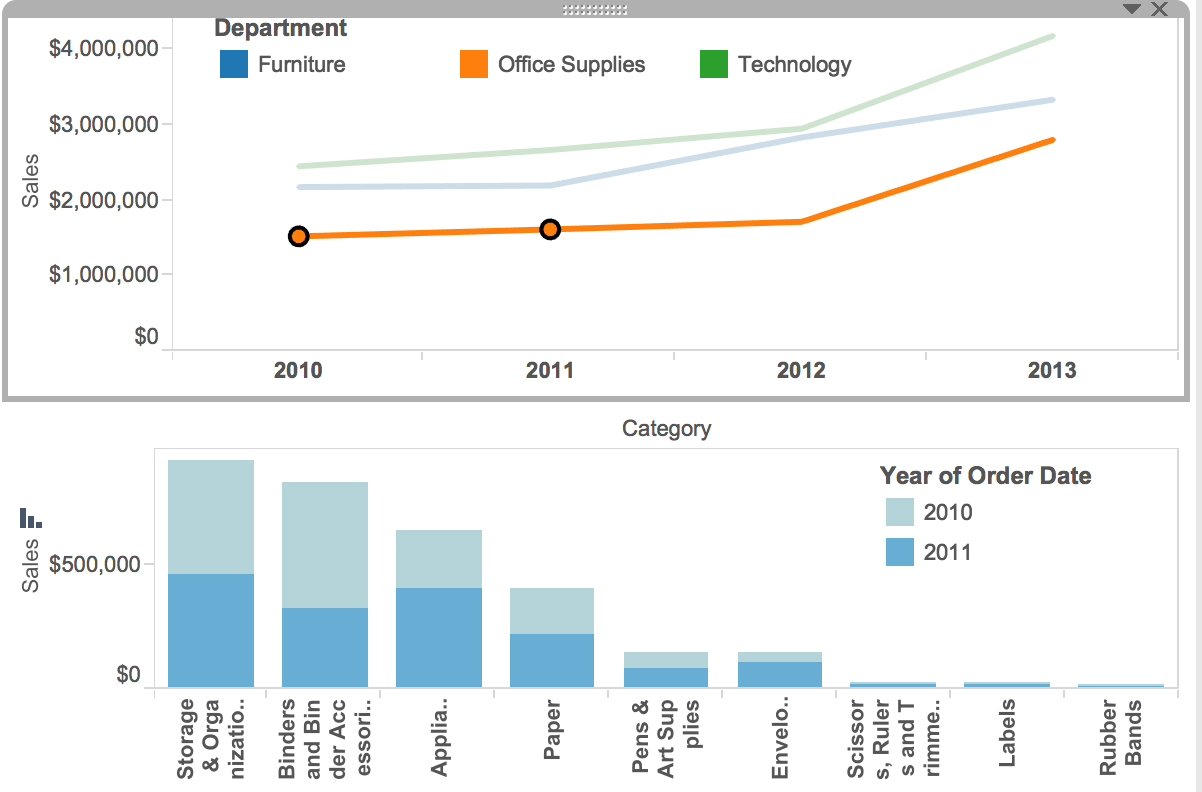

Its filtered the bar chart on both Year and Department. But what if you wanted to filter the bar chart only by Department, and keep showing all Years? Well you can create a dashboard action to do that by using 'Selected Fields'
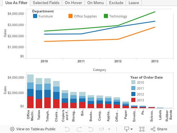
Method 2: Use the Dashboard Action menu
Choose 'Dashboard'->'Actions'->'Add Action'->'Filter'->'Selected Fields'->'Add Filter' and start picking fields. But remember that the fields have to be in the view to be available to use as filters!


Now if I click on one of the lines, it will filter the bar chart by Department only, and all Years will still be shown:

Got that? Good :-)
When I was new to using Tableau I just clicked 'Use as Filter' all the time, but that doesn't allow you the full flexibility you might need to provide your users with the most useful views. So now I always try to build my actions from scratch to get exactly the behaviour I want.
What are the other options presented in the filter action dialog box? Well you have 'Run action on' options Hover and Menu. And 'Clearing the selection will' options Leave the Filter and Exclude All Values. In the viz below I have provided dashboards that demonstrate each of these options on the same two charts, in each case filtering from the line chart to the bar chart. Hover and click around and you will soon get a feeling for how these actions operate:
Use Case 2: Pre-Filtering a Large Table
Here's the use case for this one: You have a dashboard that includes a table, which you want there to be able to show some detail to users upon a filter choice. Easy, you can just show the whole table and then add a regular quick or dashboard filter right? But what if the unfiltered table is MASSIVE. It will probably take a long time to load via Tableau Server and people are going to get bored waiting for it.So the thing to do is to have that table empty at first, and then to show the detail only when a filter choice is made. This will speed up the load time dramatically, especially on big data sources. Here's how you do it:
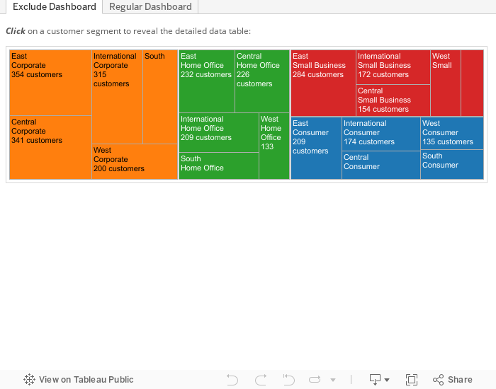
First off, create a dashboard including a table, here's a simple one showing customer numbers by region and segment in a treemap, and then customer details in a table:

Add in a filter dashboard action that looks like this, note the selection under 'Clearing the selection will'

At first nothing will look like it has changed. If you click on the treemap, it will filter as per normal. But when you click on the treemap in the same place again, clearing the selection, the table will clear completely and look like this:

See how there's nothing in the bottom segment? This is the time to publish the dashboard to Tableau Server so that when it loads in the browser, the load will be super fast. BUT, don't forget to add some instructions for your users in the title or in some text, like this:

Here's the 'exclude' version side by side with a regular filter. The data size here isn't massive so the load time won't be too different, but see what you think of the functionality.
Use Case 3: Creating a 'Cross-Blend' Filter
Data blending can be pretty cool, its a great way of bringing together disparate data sources and data types in Tableau without the need for any additional software or ETL work. It can also be a bit limiting to the functionality you can implement. One example of this restriction is Quick Filters. Its unfortunately not possible to add a quick filter from one data source that works on the different but blended data source. Try it, it probably won't work.Tableau actually provide a pretty good explanation of how to deal with this problem here http://kb.tableausoftware.com/articles/knowledgebase/filter-data-sources but they left out one important detail.
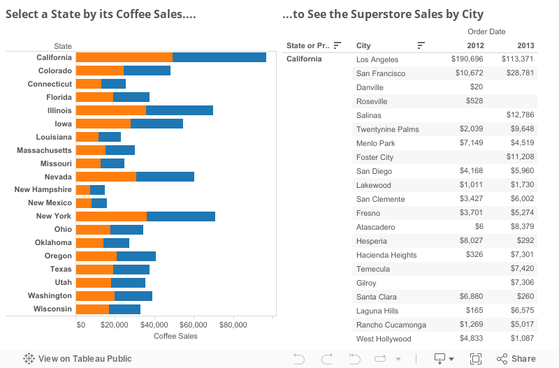
Take the dashboard below, showing coffee sales by state (from data source), and superstore sales by state and city (from another data source). And we want to allow the user to select a state in the left hand view to filter the state in the right hand view.

Data is blended on State = State or Province

So the filter action is set up as usual:

Now here's the important bit. If your blend field has the same name in both data sources, then using 'All Fields' will work. But if the field names are different it won't work, so you NEED to use 'Selected Fields' AND make sure you are pointing to the OTHER data source:


And now its going to work:
Use Case 4: Showing Images
This one is my personal favourite, as seen in a whole bunch of my Tableau Public vizes like this one and this one.
One of the objects you can add to a Tableau dashboard is the 'Web Page', as seen here:

Adding a web-object allows you to embed one of two things in your dashboard. 1) A static web-page or 2) a web-page that will change, driven by a dashboard URL action. If you want to add an action driven web-page, simply drag and drop the Web Page object into the dashboard and leave the space for the URL blank.

Then create a URL dashboard action that points to a URL that contains a field name. For example http://en.wikipedia.org/wiki/<City> (more on this here).
Now this is great, but the downside is that most of the time, whole web pages look pretty crappy inside dashboards. Things get a bit squished and there are inevitable scroll bars. It can end up looking something like this:

But, have no fear! There is a very good use for Web Objects and URL actions in Tableau dashboards, and that is to show images. Say you are making a Tableau dashboard for a retail or consumer goods company, wouldn't it be useful for the people using the dashboard to be able to see the objects they are reviewing the sales of? You provide this option by using custom shapes, which can look pretty darn cool like this. BUT custom shapes are lower resolution, and it can be a real pain to collect and organise all the picture files if you have a long list. URL images are the answer.
There are basically two ways to provide URL based images.
One is to create a datasource which includes the full URL for an image in the data source. For example to get a nice picture of Cairo to replace the Wikipedia page above, I can find one on the internet, say on Wikipeda..., right click on the image and copy the URL. You can then add this to a datasource (say an Excel file), either the main data source or a look up table you can blend on.

You can then add a URL dashboard action that points to the field in the datasource where you placed the picture URL. That's exactly what I did for the Skyscraper viz with a new field called 'Image2' (see tips about sizing too). Also note that I set 'Run action on' to Hover so that users would accidentally stumble upon the image action, encouraging interactivity and engagement.


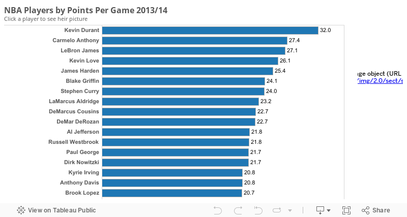
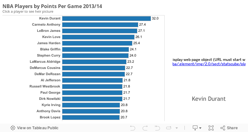
The other option is to use fields WITHIN a set URL to drive the action. This works really well if you know a set of image URLs will follow the same format. For example check out this URL from the NBA website
http://i.cdn.turner.com/nba/nba/.element/img/2.0/sect/statscube/players/large/lebron_james.png
Copy that URL into your browser and try changing 'lebron' to 'kevin' and 'james' to 'durant'.
Well you can use a dataset with the fields First_Name and Last_Name to automate this change as a Tableau action with a URL that looks like this:
http://i.cdn.turner.com/nba/nba/.element/img/2.0/sect/statscube/players/large/<First Name>_<Second Name>.png
Here's a little dashboard NBA player dashboard utilizing the URL action:
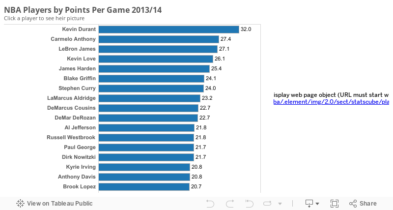
One thing to note here is that the fields <First Name> and <Second Name> are not displayed in the bar chart view, instead the full name in a single field is shown. So its important to note that the fields you use to drive the URL don't have to be in the view, BUT they do have to be 'in play'. This can often be achieved by placing the field into 'Detail' on the marks card.

IMPORTANT NOTE - you can only have one of these type of objects per dashboard.
And here's another tip: be careful of size.
In Tableau Desktop, any URL picture will automatically resize to the size of the Web Page object you have inserted in the dashboard, like this:

See the tiny little Kevin Durant? BUT Tableau Server does not auto-resize the image, and so you will be left with an ill fitting picture that requires scrolling, like this:
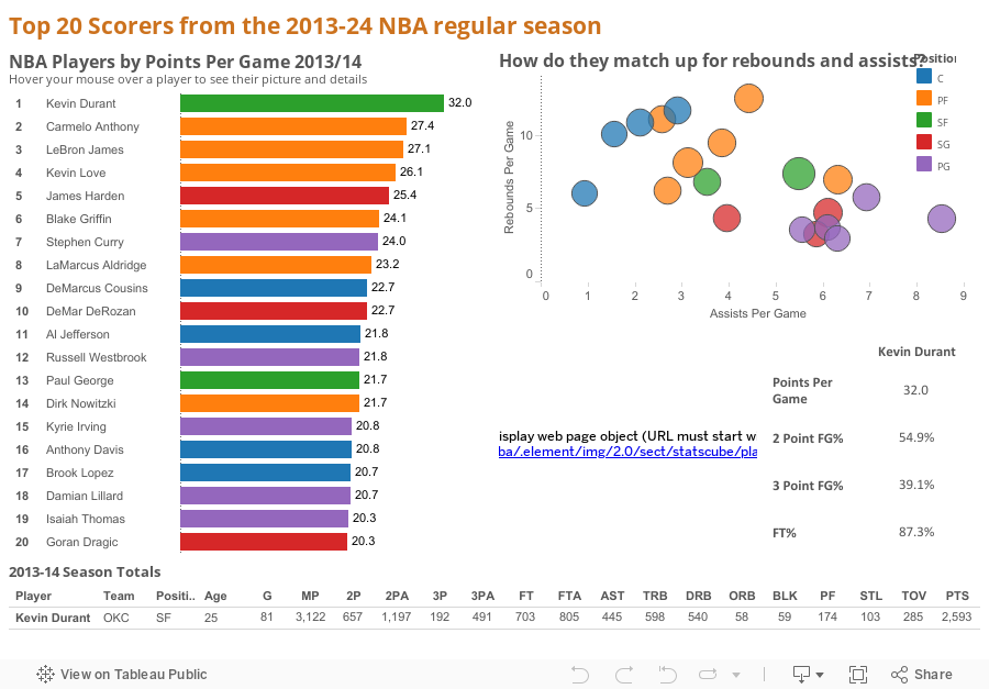
Use Case 5: Dynamic Text or Titles
That last use case, showing NBA players images, was pretty cool so I'm going to continue with it. Bt now I'll show how to also include the selected players name below the image.Here's what to do:
Create a new sheet that includes just player names. Here's how you can set that up quickly - drop Player into Rows, drop it again into Text, un-show the header, delete the tooltip and get rid of shading and borders in formatting:


Then drop this new sheet into the dashboard in a small container, hide the title, format it to center align and get your font the right size, and set up a filter action that looks like this:

And hey presto! Text that changes to go along with your image:
Use Case 6: Linking Out to Web Pages
Remember how I said in Use Case 5 that usually full web pages look crap inside dashboards? Well thankfully there is another option if you do want to link to a web page. This one is super simple, you create a URL action, but you don't include a Web Page object in the dashboard.The only other consideration with this is how the action is triggered. In almost all cases you will want to use 'Run Action on Menu'.
Again, here's some NBA data with this action in play. Notice how when seen through server, the menu option is actually a hyperlink that pops up when you hover over a point to reveal the tooltip. Note also that the text in that hyperlink text is the same as the name you give the action:
One use for this I like to use is to jump to Google Streetview based on latitude and longitude data e.g. http://maps.google.com/?cbll=<latitude>,<longitude>&cbp=12,20.09,,0,5&layer=c
IMPORTANT NOTE: These actions don't mix well with actions driving URLs with web page objects. You can have either or, but not both.
Use Case 7: Highlighting and Labelling
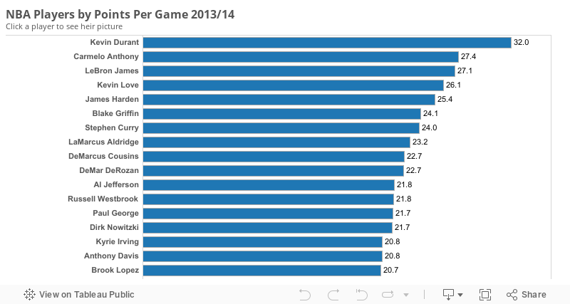
This is a pretty neat trick. Say you have the following dashboard with a bar chart and a scatter plot (I'm sticking with my NBA data here). And you want to click on a player on the bar chart to see where they appear on the scatter plot:
Well what you don't want to do is just add a filter, or this happens!

well that's no good is it. So you can use a highlight action instead, but what if you add a highlight filter and select two players, which is which? In this case, which of these two centers highlighted in the scatter plot has the higher rebound rate? Anthony Davis or Dwight Howard?

Here's what you do. Go into the sheet that holds that scatter plot, add the Player field (or whatever field you are using to break up the detail of the scatter plot) to 'Label' on the marks card and choose 'Highlighted'. Now when you select some marks on that bar chart, the respective names show up on the scatter plot.


Use Case 8: Switching Dashboards
Dashboard actions can also be used to move between dashboards, either filtering data on the way, or simply moving from one to the next. I often utilise this functionality to offer users the option of moving from a chart heavy dashboard to a table based view which they may want to review in detail or export.Here's how you set this up. Start making a 'Filter' dashboard action as per use case 1, but this time point to a DIFFERENT dashboard as the target sheet. There is a drop down that lets you pick the dashboard you are going to switch to (I chose 'Player Detail'). Again the Name becomes the hyperlink text if you use the Menu option, which I recommend.

In the case above I chose to filter on Team at the same time as switching dashboards, but if you use selected fields and don't pick one, the dashboard switch will occur without any extra filtering. Pretty neat!
If you are going to build in a field filter along with the dashboard switch, be careful as it can lead to some user confusion. For example if you have a quick filter on the target dashboard, be warned that quick filter is not going to reflect the selection you made with the dashboard to dashboard action. One way to get around this is to offer your users a 'show all' button they can hit to drop the existing action filter.
To do that, create a new work sheet which includes a single field, a calculated field that contains only text. Something like this:

Then bring that into the second dashboard and add a basic dashboard action, based on the field you filtered on, like so:

Because that field (in this case Team) doesn't exist in the 'show all' sheet, clicking the dashboard action will clear the filter, and any further clicks will have no effect. It will also reset the quick filter, which is handy!
Check out this all working below.
Use Case 9: Mixing Things Up
Ok so we've gone over a load of different action types and shown what can be done with them. The last thing I'm going to talk about is using multiple actions in the same viz. You can use as many actions as you want, and have different types of actions that are all driven from the same sheet. This can be really powerful when you are designing for interactivity. Some sheets you may want to filter, others to highlight and others still to show images, text or tables.But be careful. Dashboard actions that conflict or do contradictory things will be very confusing, and just because you can add in loads of interactive functionality doesn't mean you should. Often times its best to keep things simple. Dashboard actions should add to the user experience, not detract from it.
Having said that, check out the viz below. Its a simple viz but there is quite a bit of interactivity delivered without the use of quick filters or parameters. There are 5 different hover driven dashboard actions built into this single viz, can you find them all?
One final note. I discovered whilst putting this blog post together that the Safari web browser works way better with actions and images in Tableau Public than Google Chrome does.
really appreciate all the effort you made in putting this post up! I found the use case 8 to be something so simple yet i haven't used it so far in my dashboards, will rework them to see where it can help, thanks!
ReplyDeleteHey Anubhav, thank you for the comment, and glad you found some use for it straight away - let me know how it goes
DeleteTop stuff Pete. I use most of these cases regularly. One thing I would highlight is the importance of naming your actions and filters intuitively. Things can get confusing so a solid naming convention is important.
ReplyDeleteCheers
@paulbanoub
vizninja.com
Thanks Paul and good shout on the naming. When you've got 5 filters in there, remembering what 'Filter 3' does can be real headache.
DeleteComprehensive! Quite like the labelling one, really simple but looks smart.
ReplyDeleteOne must act in painting as in life, directly.Sculpture is the best comment that a painter can make on painting.
ReplyDeletePaint Booths
Hi ,
ReplyDeleteVery niche scenarios . I am glad, i came across this blog. I really like it.
Could you also share some scenarios involving use of parameters , complex calculated field and date calculations.
That would be great for the rookies in tableau.
Thanks,
Akash.
Wow. Thank you for this really detailed and helpful post.
ReplyDeleteExcellent information !!! Very useful !!! Save me a lot of time !!!!
ReplyDeleteThis comment has been removed by a blog administrator.
ReplyDeleteAwesome Post ! Thanks for sharing .... I have learned something new here. Thank once again.
ReplyDeleteFilter Easy deals
Hi Peter,
ReplyDeleteI was looking for solutions for a couple of dashboards I was working on, almost all requiring filter/actions and this post seems to be an almost exhaustive list of the interaction feature of tableau as I found almost all my solutions here! :)
One of my workbooks required a feature similar to user case 8: switching dashboards but I could not pull it off. I posted the same in the tableau forum but have not heard back. If I am not asking for too much. Would you mind taking out a few minutes, at your convenience, and have a look at my dashboard? I could share the tableau forum thread or inbox you my workbook. Any suggestions from your good self would be of great help. Please let me know.
Thank you once again for helping nascent learners like us with such informative posts!! :)
This comment has been removed by a blog administrator.
ReplyDeleteGood post!
ReplyDeleteThank you first of all, Actually we provides Tableau training for the students& it has more scope in future also.
If you want to learn Tableau Online Training just click
This comment has been removed by a blog administrator.
ReplyDeleteThis comment has been removed by a blog administrator.
ReplyDeleteGreat Information admin thanks For Your Information and Anybody wants
ReplyDeletelearn Tableau through Online for Details Please go through the Link
Online Tableau Training with free Demo class in USA | UK | INDIA | SINGAPORE
This Will Helps you allot.
This comment has been removed by a blog administrator.
ReplyDeleteThis comment has been removed by the author.
ReplyDeleteThis comment has been removed by the author.
ReplyDeleteThis comment has been removed by a blog administrator.
ReplyDeletegreat article loved itkeep it up.....
ReplyDeleteHi Peter, I came across your blog when I am looking for ways to add 'Reset Filter' button on a dashboard. Your scenario 8 has clues for me to get the 'Reset' button working. However, when I tried it on the Superstore data set, it is not working. Can you please explain how the action works in a little more detail?
ReplyDelete
ReplyDeleteThe author has done a great job in this article. Thanks for given experiments with data visualization using Tableau Software. When I was looking to learn about Tableau, one of my friend suggested one more good resource related to tableau to me. It is providing from basic to advanced level knowledge in Tableau. To know more info: https://intellipaat.com/tableau-training/
This comment has been removed by the author.
ReplyDeleteRespective guides and technical analysis explained here are almost governing true facts which are giving every possible stance required to be made by the students herewith. splash designs
ReplyDeleteHey I don't have words to describe this post. I simply want to say that absolutely informative post. It inspires me a lot. Keep posting.
ReplyDeleteWeb design Cairo
Good work! Appreciate your effort :)
ReplyDelete