
Update: all entries are now up here and if you like mine you can vote by tweeting #MobileIronVizpgilks
This contest was a bit different from others because the instruction was not based around a data topic but instead you need to show that you have used the new Device Designer feature, and design a single dashboard that work on both mobile and desktop - and the data topic is open ended!
I found this contest much more of a challenge to get started with than previous contests. One reason was the open ended question of what data set to use - where do I even start and what hasn't been done before? When I enter a contest like this I like to try and do something completely original, but the Tableau Public library is becoming crowded, especially with things like Make Over Monday happening, and it can feel like the number of unexplored datasets is quickly diminishing.
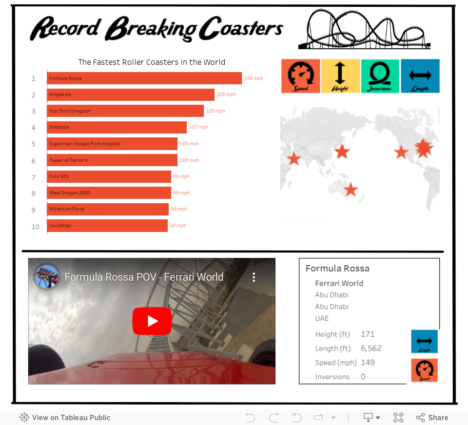
After much handwringing I decided to go back to an idea that I had ages ago, back in 2013, just after I made this viz about the tallest buildings in New York. And that was to do something about the most extreme roller coasters in the world. So I thought I'd revisit this topic, and at the very least if it didn't win it would scratch a long standing itch. I don't have as much time for Tableau Public as I used to and so its nice to use the time for something I have had on the to-do list for a good while.
The other tough bit about this was using the Device Designer to make a mobile friendly dashboard as I haven't done that before and needed to get used to the new feature. I learned a few things about it which I'll detail below.
Below is the finished design - you might note that its pretty simple, and this is purposeful. I wanted to challenge myself to see if I could make an engaging dashboard that could fit onto a single phone screen without scrolling. My thinking here was that, to put it bluntly, most people can't be bothered to scroll. And scrolling with interactive dashboards can sometimes cause click confusion. Of course in order to achieve a single screen view, it needs to be very simple and pared back.
Of here's a screen shot of the mobile version and the desktop version, and an interactive version is below. This will change depending on how you are viewing this blog!


Data is sourced from rcdb.com
!!! Update: I just tested this blog post on my phone and the viz below looks all screwed up, please click this for how it should look if you are browsing my blog on a phone
So what did I learn making this viz?
1. Keep things (even more) simple
I'm a big fan of simple straight forward design in Tableau, but with mobile you have to taker that to another level. A couple of tips that I took from Dash Davidson's blog post were to ensure I lock my map and to use only actions as filters and avoid quick filters and other drop downs. Drop down menus can obscure everything on mobile so are best avoided. I also tried to keep my sheet arrangement simple so I could be sure it would look consistent across different platforms, and to avoid potential confusion brought in by things like hidden sheets that pop out.
Tooltips are also hard to use on mobile because of the space constraints and so I limited these to only the bar chart and used highlight labelling instead on the map.
The challenge of keeping things really simple actually turned out to be quite worthwhile - it's easy to get carried away building fancy things in Tableau almost for the sake of it. The restrictions of designing for mobile focus the mind on what's really useful. I have even more respect for app designers now!
2. The order that you make things with Device Designer matters, a lot
In my first attempt at this viz, I went straight to the 'Phone' setting on the Device Designer and designed a viz that would look good on a phone. The thinking here was to design 'mobile first' as mobile is these days the primary route to the web, and because the contest was introducing a mobile component.
The difficult thing about this was what happened when I tried to take this as the basis and go and build out a desktop version.
The rookie mistake I had made was not to build the 'Default' dashboard first, and so everything I had done on the phone version was not there for other versions and I had to try and build things back up from scratch. I got pretty confused with the workflow and ran myself around in circles.
Eventually I decided to scrap my efforts and start again. This time I designed 'desktop first' within the Default view, and then adapt to phone. From a practical point of view this proved to be much easier. But it also meant that everything I was doing I was also having to think one step ahead to 'what will this look like when I switch to phone'.
3. Font sizes are tricky!
Even though a desktop screen can be really big, and a phone screen is really small, your fonts used within sheets are not going to automatically re-size. I wanted big fonts on desktop and small fonts on mobile, but this would have meant making multiple versions of the 'Default' view and would have negated the purpose of the Device Designer. So I spent some time trying to pick font sizes that looked reasonable on both devices.
4. You can't use new sheets, but you can use new objects
The way the DD works, only the sheets in your default view are available to you to use in your device specific versions. So you can't have a 'big bold' version and a 'small simple' version of the same sheet. At least I don't think you can without doing something clever with hidden sheets. I didn't want to get involved in that kind of trickery so I worked within the limits most users will experience.
You can however add new images, text objects and web objects, so this gives you some flexibility with titles and pictures. I tried to utilize this in my viz.
5. You might have even less space than you think - always test the reality
If you are going to make a mobile dashboard, you absolutely MUST test it on a phone. Looking at the view on Tableau Desktop, or using an emulator on your desktop is not going to do the trick. Your mouse pointer is very different from my fat fingers, and scrolling on your magic mouse is a lot different from scrolling with a thumb. If you don't test properly you might be kidding yourself as to how your viz looks and works.
When I opened my viz on my phone I noticed that the visible screen was actually much smaller than I expected because of the extra headers that Tableau Public adds by default. You can get rid of these headers by altering the URL to include &:showVizHome=no, check out the difference between these two links on your phone
https://public.tableau.com/views/RecordBreakingCoasters/RecordBreakingCoasters?:embed=y&:display_count=yes
https://public.tableau.com/views/RecordBreakingCoasters/RecordBreakingCoasters?:embed=y&:display_count=yes&:showVizHome=no
Thing is, you can't guarantee that people will see your viz with the URL changes, so design for the worst/smallest possible scenario. Below is a picture of how my viz looked on Tableau Desktop as per iPhone 6, and then for real on my iPhone 6.

Anyway, I think I finally got the hang of this, I hope my experiences above can help you get a head start on using this new feature. It is pretty cool to finally be able to know that your viz will be able to be viewed on a phone, and the restrictions of size are actually a welcome challenge that focusses your mind on simplicity.
And I hope you enjoy exploring the worlds fastest, tallest, longest and most upsidedowny roller coasters...