

Blog focusing on my experiments with data visualisation using Tableau Software.
Tuesday, 15 December 2015
OK Chewie
Tableau recently put out a Star Wars web-data connector and asked people to see what they could come up with http://www.tableau.com/about/blog/2015/12/when-star-wars-meets-data-geekdom-47549?es_p=1088362. Well, I came up with this......
Wednesday, 25 November 2015
Approval Ratings of US Senators
Quick political disclaimer - I think Bernie Sanders should be the next US President, even though I don't get a vote....
I recently came across this article on Morning Consult showing the results of a recent poll that placed Bernie Sanders as the US Senator with highest within State approval rating. I wanted to skim the results of the survey, but unfortunately they were presented in a pretty boring way that made it hard to quickly navigate and explore. I thought I could probably do a better job.
And so I came up with this

Now the hex-bin map is something I've been wanting to try, and thanks to both Matt Chambers and Brittany Fong for their recent instructional blog posts on how to do this. I wanted to use Matt's technique, and he kindly provides some clear instructions and base data to copy. Definitely read his post to understand what I'm doing below.
But because there are two senators per state, I needed to split up the hexagons. To do this I created both a left and a right half-hexagon, using powerpoint as my tool, and placed each in the Tableau Shape File repository. I was going to re-color the shapes in Tableau anyway so don't worry about the shades below.


And I needed to adjust the positioning of each half of the state, so I nudged one half left and one half right a bit.

See how my column field includes values 0.25 away from the centre of where the hex's will be placed?
Lastly, I wanted to use Net Promoter Score because I didn't think the straight approval rating tells the whole story. And as you know I can't resist throwing in a URL picture.
Feedback welcome, and feel free to use this technique for any Senate related vizzes in future!
I recently came across this article on Morning Consult showing the results of a recent poll that placed Bernie Sanders as the US Senator with highest within State approval rating. I wanted to skim the results of the survey, but unfortunately they were presented in a pretty boring way that made it hard to quickly navigate and explore. I thought I could probably do a better job.
And so I came up with this
Now the hex-bin map is something I've been wanting to try, and thanks to both Matt Chambers and Brittany Fong for their recent instructional blog posts on how to do this. I wanted to use Matt's technique, and he kindly provides some clear instructions and base data to copy. Definitely read his post to understand what I'm doing below.
But because there are two senators per state, I needed to split up the hexagons. To do this I created both a left and a right half-hexagon, using powerpoint as my tool, and placed each in the Tableau Shape File repository. I was going to re-color the shapes in Tableau anyway so don't worry about the shades below.


And I needed to adjust the positioning of each half of the state, so I nudged one half left and one half right a bit.

See how my column field includes values 0.25 away from the centre of where the hex's will be placed?
Lastly, I wanted to use Net Promoter Score because I didn't think the straight approval rating tells the whole story. And as you know I can't resist throwing in a URL picture.
Feedback welcome, and feel free to use this technique for any Senate related vizzes in future!
Monday, 9 November 2015
Let's put some things into context - a practical introduction to Context Filters in Tableau
One piece of functionality in Tableau that I've been using a lot recently, and that people have been asking me about are CONTEXT FILTERS. They seem to cause quite a bit of confusion for new Tableau users so I thought I'd try and write a blog post showing some of the ways in which they can be utilized. This should also help me get a firmer grip on them myself, as I too find knowing when to use them isn't always straight forward.
Now what I'm not going to do here is talk about Context Filters in terms of performance. My experience with using context filters to improve performance is very hit and miss, sometimes it works, sometimes it slows things down and sometimes there is no difference. This all depends on your data connection type, the size and width of your data and what you are trying to achieve with the filter. For improving performance with context filters I suggest you utilise the ever popular 'try it and see' approach. I am going to talk about Context Filters in terms of functionality and give some examples.
First up, how do I make a regular filter a Context Filter?
This one's easy - you simply right click on your filter pill (or click the drop down arrow) and select 'Add to Context'.


You will notice that the filter pill turns grey. This is, in classic subtle Tableau style, your clue that the filter is 'in context.
Also worth noting is that context filters can be for single sheets, multiple sheets or all sheets. But it will be in or out of context for all sheets, you can't apply to many sheets and then switch in and out of context on different sheets.
Aggregation based filters (e.g. sum(sales)) cannot be added to context.
What does a Context Filter actually do?
In simple terms, putting a filter in context ensures that all other filters are dependent on that Context Filter. Tableau filters otherwise act independently and this is a useful feature, but may sometimes mean that filtering doesn't do what you might first expect it to do.
Thursday, 29 October 2015
Sunshine on my Shoulders
I don't know about you, but I'm already bored of this autumnal verging on wintery weather. As I was walking home from work tonight (in the dark and cold), feeling pretty glum and a bit SAD I thought "I know what would cheer me up, some sunshine and a nice viz". And so I've finally gone ahead and made the more up beat counterpart to my rain viz.

A couple of notes:
- Sunshine hours are not the same as daylight hours, they are also affected by cloud cover, rain etc... see this explanation
- When publishing this viz, I overwrote my original rain viz on Tableau Public by mistake by doing 'Save to Tableau Public' and not 'Save as to Tableau Public'. Be careful! If you are working from a previously published workbook, as I was here, then saving to Tableau Public will overwrite with no warning! I've lost that lovely counter which showed it had over 20,000 views..... :-(
Monday, 26 October 2015
Rain clouds - now with animation!
Remember that rain viz? Well here it is again, only this time with extra bonus feature animation. Click the green button once to start and once to stop.
Want to know how its made? Then look here

Want to know how its made? Then look here
Saturday, 24 October 2015
Tableau Conference 2015 - My thoughts
So today is recovery day - recovery from the epic week in Vegas that was Tableau Conference 2015. For various reasons this was probably my favourite conference yet, which is saying something, so I thought I'd use this sofa day to get some thoughts down before I forget (I did this in 2013 too, but forgot last year). Ok here goes.....
1. Tableau has gotten to be freaking huge!
Do you know how big the MGM Grand is? Its really really big. And Tableau is now a big enough company, with a big enough community to fill it with no problem. The first US Tableau Conference I went to was San Diego in 2012 - it was awesome and I thought at the time it was a very big event. Looking back it seems teeny tiny.
I was an early-ish adopter of Tableau, not one of the true renegades but I got into it in 2010 around version 5.2. Back then every time I talked about Tableau with someone, they had never heard of it and I got to introduce them to it. Between then and now Tableau has gone (sort of) mainstream and is a publicly listed company. Now I over hear people talking about Tableau on the street, in coffee shops and on the subway (seriously, these three things have happened). I also met someone at a meet-up who said he was looking for alternatives to traditional BI tools like Tableau - oh how times have changed!
Three really important things haven't changed about Tableau and the conference though, despite the increase in scale:
i) The excitement among the attendees and the community is genuine - hearing people scream and applaud the announcement of new features like 'viz within tooltip' warms my nerdy heart.
ii) The company still cares - I got to meet many people from the Dev team and they really want to hear customer feedback and find ways to make things even better
iii) I still get to hang out with some of my best friends in the world, and from all over the world, in one place for a short but magical week.

2. My thoughts on new features
Devs on stage, introducing new features during the opening keynote was one the highlights of the conference, as really it should be. All the devs did an amazing job presenting, half of them could quit Tableau for a career in stand-up comedy if they wanted. Anyway, features that caught my eye included:


Slalom were out in force at this conference, there were something like 50 of us there and I got to meet colleagues from around the country. I also got to present with Nelson Davis and John Mathis on the Ebola project we've been working on for the Tableau Foundation. John and Nelson have poured serious amounts of effort into this project and I was so happy to be able to present it with them.


Also a big shout out to my great boss from the New York office Jim Gurney and my NY colleague Steven Carter who have both been incredibly supportive to me (pic below of us at the keynote). And thanks to James Young and Allan Walker for organising a killer party for the Zen Masters and Tableau Devs, what a view!


5. Seeing the impact of last years blogging session
At the 2014 conference in Seattle, Jewel Loree organised a panel on Tableau blogging with both myself and Andy Kriebel. The session was REALLY well attended and was a lot of fun, you can still watch it here. Well after that, tweets started pouring in from people who attended and had set up their own blog because of it. Fast forward a year, and one of those people who was inspired to start a blog is an Iron Viz contestant and is featured on this years blogging panel. Oh and I'm pleased to say he's now a colleague of mine too - that's Matt Chambers.
Another person who attended that panel session in 2014 was Chris Jones. Chris introduced himself to me at the conference and I was really inspired by his journey with Tableau in the last year - he's even been teaching it to kids at his son's school. Check out this presentation he gave to them, the bit about teaching dimensions, measures, continuous and discrete with a dog is pure genius.

I'd love to hear the 'one year on' stories from other people who attended that session.
6. Personal highlights
Ok now its time to show off and brag for a second. But did you see my rain viz on that really big screen being used to demo new features to 11,000 people in a fricking arena?!?! Man that felt good. Shame they took away the clouds though. Compare and contrast with the original below.


Other highlights included the Zen Master presentation, being a Tableau Doctor for an hour, Paul Chapman's EasyJet talk, the New York New York roller coaster, Neil DeGrasse Tyson happy hour, meeting up with Slalom clients, receiving smuggled Bacon Jam from Carl Allchin and tweeting it to the big screen, but most of all just hanging out and having fun with everyone, especially these two

1. Tableau has gotten to be freaking huge!
Do you know how big the MGM Grand is? Its really really big. And Tableau is now a big enough company, with a big enough community to fill it with no problem. The first US Tableau Conference I went to was San Diego in 2012 - it was awesome and I thought at the time it was a very big event. Looking back it seems teeny tiny.
I was an early-ish adopter of Tableau, not one of the true renegades but I got into it in 2010 around version 5.2. Back then every time I talked about Tableau with someone, they had never heard of it and I got to introduce them to it. Between then and now Tableau has gone (sort of) mainstream and is a publicly listed company. Now I over hear people talking about Tableau on the street, in coffee shops and on the subway (seriously, these three things have happened). I also met someone at a meet-up who said he was looking for alternatives to traditional BI tools like Tableau - oh how times have changed!
Three really important things haven't changed about Tableau and the conference though, despite the increase in scale:
i) The excitement among the attendees and the community is genuine - hearing people scream and applaud the announcement of new features like 'viz within tooltip' warms my nerdy heart.
ii) The company still cares - I got to meet many people from the Dev team and they really want to hear customer feedback and find ways to make things even better
iii) I still get to hang out with some of my best friends in the world, and from all over the world, in one place for a short but magical week.

2. My thoughts on new features
Devs on stage, introducing new features during the opening keynote was one the highlights of the conference, as really it should be. All the devs did an amazing job presenting, half of them could quit Tableau for a career in stand-up comedy if they wanted. Anyway, features that caught my eye included:
- Vizzes in tooltips - This is going to have a BIG impact on the way we design things. This should be called the 'Andy Cotgreave Tooltip' in memoriam of this hack
- Cross data source joins - lets face it, data blending can be a pain in the neck
- Quick filters that work across data sources - this is going to be a big big benefit in dashboards that take data from different places, and will get around some of the problems that exist with parameters
- Quick highlighting - or whatever its called is going to make scatter plots untouchable on my list of favourite chart types
- Device specific dashboards - I'm still not sure that this is the 100% best answer, but mobile is a big problem for Tableau right now and this is definitely a step in the right direction.

Device specific dashboards being presented - recognise the viz? More on that later :-)
Some things I would have liked to have seen but didn't:
- Dynamic parameters - simply as in parameters that update from a field. Seriously, another year with no solution??
- Auto Save - as above, why not?
- Easier formatting - global formatting is coming (yay!) but I don't think this includes things like customizing tooltips which is my major bugbear.
3. Shine Pulikathara rocked it at Iron Viz
The fact that some people go to the Tableau Conference but don't go to see Iron Viz baffles me. Its the GUARANTEED BEST SESSION every year. This year's data set (GDELT) looked really difficult to work with but each contestant pulled something out. My Slalom colleague Matt Chambers (more on Matt later) came up with some really clever calculations around media bias - but ran into some trouble making them work in the 20 minutes. And Skyler's viz was wonderfully colorful. But there was no dispute about the winner. I mean check this thing out, 20 minutes??!

And there were some lovely finishing touches like this:

Shine did a great job presenting what is really a wonderful viz in terms of both design and storytelling. The black and white newspaper theme reminded me of my own newspaper themed viz I did a few years ago, which now looks a bit amateur in comparison! You can also see Shine's work on Tableau Public here, note that Shine didn't have to worry about font compatibility. I've been a fan of Shine's work since he started posting this year - I think this kid is going places.
And as for next year's Iron Viz, maybe I'll give entering it one last shot....
4. I work with some really great people
Slalom were out in force at this conference, there were something like 50 of us there and I got to meet colleagues from around the country. I also got to present with Nelson Davis and John Mathis on the Ebola project we've been working on for the Tableau Foundation. John and Nelson have poured serious amounts of effort into this project and I was so happy to be able to present it with them.


Also a big shout out to my great boss from the New York office Jim Gurney and my NY colleague Steven Carter who have both been incredibly supportive to me (pic below of us at the keynote). And thanks to James Young and Allan Walker for organising a killer party for the Zen Masters and Tableau Devs, what a view!


5. Seeing the impact of last years blogging session
At the 2014 conference in Seattle, Jewel Loree organised a panel on Tableau blogging with both myself and Andy Kriebel. The session was REALLY well attended and was a lot of fun, you can still watch it here. Well after that, tweets started pouring in from people who attended and had set up their own blog because of it. Fast forward a year, and one of those people who was inspired to start a blog is an Iron Viz contestant and is featured on this years blogging panel. Oh and I'm pleased to say he's now a colleague of mine too - that's Matt Chambers.
Another person who attended that panel session in 2014 was Chris Jones. Chris introduced himself to me at the conference and I was really inspired by his journey with Tableau in the last year - he's even been teaching it to kids at his son's school. Check out this presentation he gave to them, the bit about teaching dimensions, measures, continuous and discrete with a dog is pure genius.

I'd love to hear the 'one year on' stories from other people who attended that session.
6. Personal highlights
Ok now its time to show off and brag for a second. But did you see my rain viz on that really big screen being used to demo new features to 11,000 people in a fricking arena?!?! Man that felt good. Shame they took away the clouds though. Compare and contrast with the original below.


Other highlights included the Zen Master presentation, being a Tableau Doctor for an hour, Paul Chapman's EasyJet talk, the New York New York roller coaster, Neil DeGrasse Tyson happy hour, meeting up with Slalom clients, receiving smuggled Bacon Jam from Carl Allchin and tweeting it to the big screen, but most of all just hanging out and having fun with everyone, especially these two

photo credit: Jewel
Sunday, 18 October 2015
Fantasy Hoops Draft Assistant
The NBA season is almost upon us once again, and that also means that Fantasy Basketball will be starting up soon too. Last year I was in the league managed by Ben Jones of Tableau and http://dataremixed.com/ fame. I did pretty well, but I was really scrambling on draft night.
One thing I didn't really appreciate last year was how important winning the different categories is, especially the ones that don't get so much attention. For example in fantasy hoops blocks have as much clout as points, and so choosing less well known players who are strong blockers can be as legitimate a strategy as going for the big scorers.
This year, to try and help my draft approach I have come up with my Fantasy Hoops Draft Assistant in Tableau. This takes last years data and compares each player to the league average across all the categories, individually and combined to a total. Here it is:
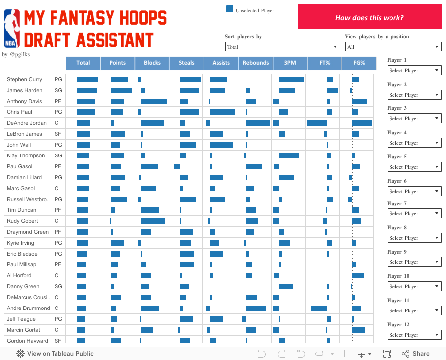
Whatever your strategy - whether selecting all-rounders or targeting specific categories, this tool should help you prepare for the draft and respond as picks are made.
The scores work like this, using points as the example:


As you can see, Level of Detail calculations come in handy here!
The FT% and FG% are slightly different. I weighted them by the number of shots taken adjusted the scores by a factor of 100 to fit along with the rest:


I also added a minimum requirement of 500 minutes played as a context filter.
Waiver: Last seasons performance is no guarantee of success this year - so please don't blame me if you use this tool and lose your league.....
One thing I didn't really appreciate last year was how important winning the different categories is, especially the ones that don't get so much attention. For example in fantasy hoops blocks have as much clout as points, and so choosing less well known players who are strong blockers can be as legitimate a strategy as going for the big scorers.
This year, to try and help my draft approach I have come up with my Fantasy Hoops Draft Assistant in Tableau. This takes last years data and compares each player to the league average across all the categories, individually and combined to a total. Here it is:
Whatever your strategy - whether selecting all-rounders or targeting specific categories, this tool should help you prepare for the draft and respond as picks are made.
The scores work like this, using points as the example:


As you can see, Level of Detail calculations come in handy here!
The FT% and FG% are slightly different. I weighted them by the number of shots taken adjusted the scores by a factor of 100 to fit along with the rest:


I also added a minimum requirement of 500 minutes played as a context filter.
Waiver: Last seasons performance is no guarantee of success this year - so please don't blame me if you use this tool and lose your league.....
Saturday, 10 October 2015
Tableau Tip - Comparing a custom date range with the prior year
Here's a quick tip based on a problem that I solved with a colleague this week. Take the following scenario:
You want to see sales for a date range which you can select as you like, and compare that with the same date range one year earlier. And here's the catch - the date range you pick can be over a year. So for example you might select Feb 2015 to Aug 2015 and compare that with Feb 2014 to Aug 2014 OR you might select Jan 2014 to Apr 2015 and compare that with Jan 2013 to Apr 2014. So the periods can overlap.
Here's how we solved it:
To see the sum of sales for the current custom period, use parameters - one for start date and one for end date. In our case all data was registered at month start and we were doing months only. Because of this we didn't want to see the calendar appear so we used a list of dates created in Excel and copy and pasted in to the parameter. Example using Superstore Sales below, note US date format:


And then duplicate the 'Start Date' parameter and name it 'End Date'.
Now what I often like to do when I want to bring back data that meets a certain criteria (in this case fit a date range, but could be 'is within a region' etc...) is create a calculated field that returns the value if the criteria is met and 0 if its not met. This means it can still be aggregated however you like and you don't have to worry about the potential conflict or impact of filtering. So in this case we wrote the following calculated field for the current period sales

Notice how the IF statement is completely inside the aggregation - that's something you can use in many situations including much more complicated calculations. And again in our example, all data was at month level.
Now how about the prior period, one year back? Well because the periods can overlap and can be any period we can't use one of the standard table calculations, at least I don't think so. So we made use of the DATEADD function with a value of 1 to offset the order date by a year, so that we pick up prior data. Like so
 A quick line plot shows that the calculations are doing what we expect


You want to see sales for a date range which you can select as you like, and compare that with the same date range one year earlier. And here's the catch - the date range you pick can be over a year. So for example you might select Feb 2015 to Aug 2015 and compare that with Feb 2014 to Aug 2014 OR you might select Jan 2014 to Apr 2015 and compare that with Jan 2013 to Apr 2014. So the periods can overlap.
Here's how we solved it:
To see the sum of sales for the current custom period, use parameters - one for start date and one for end date. In our case all data was registered at month start and we were doing months only. Because of this we didn't want to see the calendar appear so we used a list of dates created in Excel and copy and pasted in to the parameter. Example using Superstore Sales below, note US date format:


And then duplicate the 'Start Date' parameter and name it 'End Date'.
Now what I often like to do when I want to bring back data that meets a certain criteria (in this case fit a date range, but could be 'is within a region' etc...) is create a calculated field that returns the value if the criteria is met and 0 if its not met. This means it can still be aggregated however you like and you don't have to worry about the potential conflict or impact of filtering. So in this case we wrote the following calculated field for the current period sales

Notice how the IF statement is completely inside the aggregation - that's something you can use in many situations including much more complicated calculations. And again in our example, all data was at month level.
Now how about the prior period, one year back? Well because the periods can overlap and can be any period we can't use one of the standard table calculations, at least I don't think so. So we made use of the DATEADD function with a value of 1 to offset the order date by a year, so that we pick up prior data. Like so


And now we can very easily do comparative calculations of current period versus prior period, for example to see % growth across categories

hope you find that useful.
Sunday, 4 October 2015
2015-16 Tableau Zen Master
I'm very honoured to have been named a Tableau Zen Master again this year and be among such an impressive group of people - thank you Tableau!


Sunday, 20 September 2015
Room Service - The World's Biggest Hotels
Well the Tableau Conference is right around the corner, so its time for another conference themed viz. This year the conference is in Las Vegas, and one thing Vegas is known for is its massive hotels. So here's a view of how they sit among the world's biggest - turns out they do pretty well and TC15 will be held in the world number 3, the MGM Grand. See you there!

Thursday, 16 July 2015
Fighting Ebola with Tableau
In October of last year Anya A’Hearn sent an email around to the rest of the Tableau Zen Masters to let us know about upcoming projects sponsored by the Tableau Foundation, which had recently been set up.
Tableau was going to provide free software and financial support to a few select charitable projects aiming to use data to tackle problems. Tableau wanted to know if the Zens was would we be willing to volunteer our time and skills to help the project teams fully utilize their Tableau resources.
Because of my brief background working in Infectious Disease Epidemiology, and because it made sense geographically, I put myself forward to assist with a collaboration between the Columbia University Earth Institute and a company called Dimagi. The goal of the project was to utilize mobile phone technology and teams of contact tracers to conduct contact tracing to combat the spread of Ebola in Guinea, West Africa.
Contact tracing works more or less like this: After a patient is diagnosed with Ebola, the people who had been in contact with that patient (the "source case") are identified and monitored each day for 21 days, which is the incubation period for Ebola. Contact tracing is an established method for controlling the spread of a disease.


- We had to get up and running very quickly: People working on the ground needed to see information immediately and so there was little time for extensive requirements gathering, wire framing and design phases.
- Survey data can be tricky to work with: The data design had been set up to service Dimagi’s systems, and the translation to Tableau was quite tricky.
- I had a lack of familiarity with the topic: I had to learn about what was and wasn’t important as we progressed. For example, one element that turned out to be of importance was measuring the amount of resistance (even violence) the contact tracers faced when carrying out their work.
- The dataset was continually evolving: As the work progressed, new fields were added to the survey data, or changes were made to existing data to address data quality issues.
- There were language barriers: The database was in English (and English is the only language I really know) but the dashboards needed to be in French.
- Time was in short supply: I still had to hold down a very demanding day job and do this in the evenings and weekends.

John and Nelson both managed to not only show what did happen but also show what didn’t happen—a skill that anyone who has worked with data knows to be extremely difficult.
 (Some of the dashboards.)
The results
I’m very pleased to say that our hard work has been well-received, not just by the immediate project teams but also by the health management teams and frontline contact tracing supervisors in Guinea and even the government's National Ebola Response Committee. The most rewarding part of this process has been to see pictures like those below and know that we did something that is really being put to use.


Tableau was going to provide free software and financial support to a few select charitable projects aiming to use data to tackle problems. Tableau wanted to know if the Zens was would we be willing to volunteer our time and skills to help the project teams fully utilize their Tableau resources.
Because of my brief background working in Infectious Disease Epidemiology, and because it made sense geographically, I put myself forward to assist with a collaboration between the Columbia University Earth Institute and a company called Dimagi. The goal of the project was to utilize mobile phone technology and teams of contact tracers to conduct contact tracing to combat the spread of Ebola in Guinea, West Africa.
Contact tracing works more or less like this: After a patient is diagnosed with Ebola, the people who had been in contact with that patient (the "source case") are identified and monitored each day for 21 days, which is the incubation period for Ebola. Contact tracing is an established method for controlling the spread of a disease.

Understanding
the project
I met up with Dr Jilian Sacks, part of the team from Columbia who were spearheading the project. Jilian explained to me how in this situation the contact tracers would be paid volunteers from the communities in Guinea, and the recording of information would be captured on basic smart phones via a questionnaire app created by Dimagi, called CommCare. The app would lead the contact tracers through a series of questions designed to capture information about the contact and record signs of symptoms. The app also provides prompts for health information or advice messages to be delivered. That data is then submitted from the phone and loaded onto a database. And that’s where Tableau comes in.


(Aboubacar Diallo, mHealth Country Coordinator of the Program, leading a training on CommCare for Contact Tracers in one of the communes of Conakry).
Given that all this information about Ebola contacts was being captured, the goal was to utilize Tableau to visualize the information to better understand the overall picture, and more importantly to help manage the operation on a day-to-day basis.
I created a few dashboards which captured information about the contact registrations, follow up visits and closures. Creating these dashboards was in many ways different from what I normally do as a consultant and presented some specific challenges:
- We had to get up and running very quickly: People working on the ground needed to see information immediately and so there was little time for extensive requirements gathering, wire framing and design phases.
- Survey data can be tricky to work with: The data design had been set up to service Dimagi’s systems, and the translation to Tableau was quite tricky.
- I had a lack of familiarity with the topic: I had to learn about what was and wasn’t important as we progressed. For example, one element that turned out to be of importance was measuring the amount of resistance (even violence) the contact tracers faced when carrying out their work.
- The dataset was continually evolving: As the work progressed, new fields were added to the survey data, or changes were made to existing data to address data quality issues.
- There were language barriers: The database was in English (and English is the only language I really know) but the dashboards needed to be in French.
- Time was in short supply: I still had to hold down a very demanding day job and do this in the evenings and weekends.
However, working with Jilian Sacks and Elizabeth Zehe from the Columbia team on the requirements and with Tyler Sheffels at Dimagi on the database and Tableau Server, we managed to get some dashboards off the ground and into the hands of healthcare workers and officials in Guinea.

(A doctor
in charge of health for one of the communes in Conakry, the Capital of Guinea,
at a training.)
These dashboards covered summary views of the situation on the ground, but it quickly emerged that some views giving more detailed analysis of the activity of the contact tracers was required to really add value to the management of the operation.
Enter the cavalry
Fortunately for me, I have some great colleagues at Slalom and they came in to really drive these new dashboards forward.
Firstly John Mathis (of Iron Viz fame) not only helped to refine and organize the existing dashboards, but also created a couple of brilliant views that would enable daily management of the operations and the activities of the contact tracers. The views that John created proved to be extremely helpful to the project teams and are viewed every day. John also worked very closely with Tyler to get the database into the best shape possible for use within Tableau.
Next up we needed someone to help create a single overall KPI view, and for this fellow Zen Master Nelson Davis stepped up to the plate. Nelson put his Tableau skills to work to merge multiple datasets into a single page view of what had happened in the last 7 days.

The results
I’m very pleased to say that our hard work has been well-received, not just by the immediate project teams but also by the health management teams and frontline contact tracing supervisors in Guinea and even the government's National Ebola Response Committee. The most rewarding part of this process has been to see pictures like those below and know that we did something that is really being put to use.

(Dr.
Pépé Bilivogui, Lead of the Surveillance Pillar of the National Ebola Response Committee
in Guinea.)

(Dr.
Alain Achi, one of the Guinea-based project staff, leading a training on
CommCare and Tableau for Contact Tracers in one of the Communes of Conakry.)
We also received this email from Neal Myrick, who heads up the Tableau Foundation:
“Was at the Ebola Innovation Summit in SFO yesterday. Randomly met an advisor to the President of Guinea. He saw my name tag, swung his computer around and showed me the live Tableau visualizations from the project with Dimagi and Columbia University. Really stellar!”
It doesn’t get much better than that.
I presented our work along with Jilian and Beth from the Columbia team and Tyler from Dimagi at the Do Good Data conference in Chicago, which was a great experience.
What’s next?
Unfortunately the work is not done as Ebola is still present in Guinea (as well as in neighboring Sierra Leone and Liberia). Despite the fact that the world’s tv cameras have stopped filming it, the epidemic is still going and we need to keep supporting efforts to slow it. We’ll continue to do our small part by improving the information flow and hope that that makes a difference.
I’m pleased to say that we will be presenting this story at the Tableau Conference in October, so come and find out more.
The team

Subscribe to:
Posts (Atom)