Tuesday, 18 March 2014

Blue Blood

UPDATE: I made it to the final four! http://www.tableausoftware.com/public/blog/2014/03/sports-viz-contest-final-four-2403 if you like the viz please tweet with #Elite8Peter to vote

Well its that time of year again when the Iron Viz entry competitions roll around. This year the first topic is all about sports http://www.tableausoftware.com/public/blog/2014/03/submissions-open-elite-8-2365.

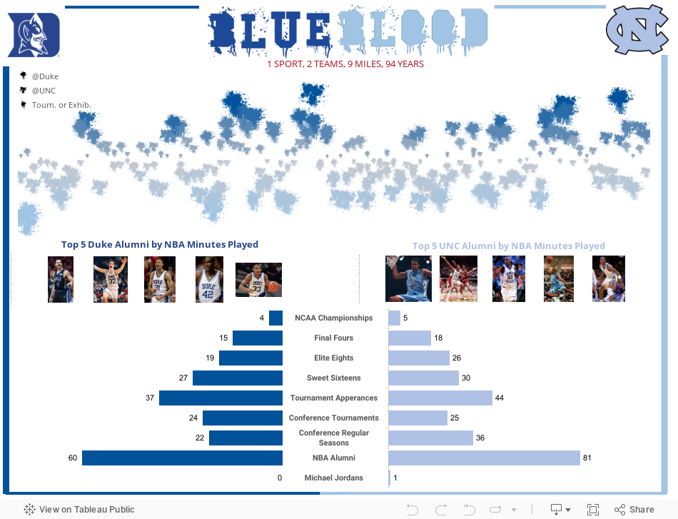
Here's my entry and its a quick history of the Duke vs North Carolina rivalry. To be honest I'm not 100% convinced with this viz, its a bit 'simple', but its a been a busy few weeks including a massive dose of the flu, so its about all I can muster for now. Anyway, hope its topically interesting.


Thursday, 27 February 2014

Taking a look at what the minimum wage means across the USA

Recently my colleagues at Slalom Consulting have launched a great concept called Viz for a Cause - http://www.vizforacause.com/ which is designed to be a place to gather visualization pieces that address both global and local issues. The hope is that in doing so we can more easily share the stories and the evidence around the things we believe are important - and in turn engender debate, discussion and engagement.

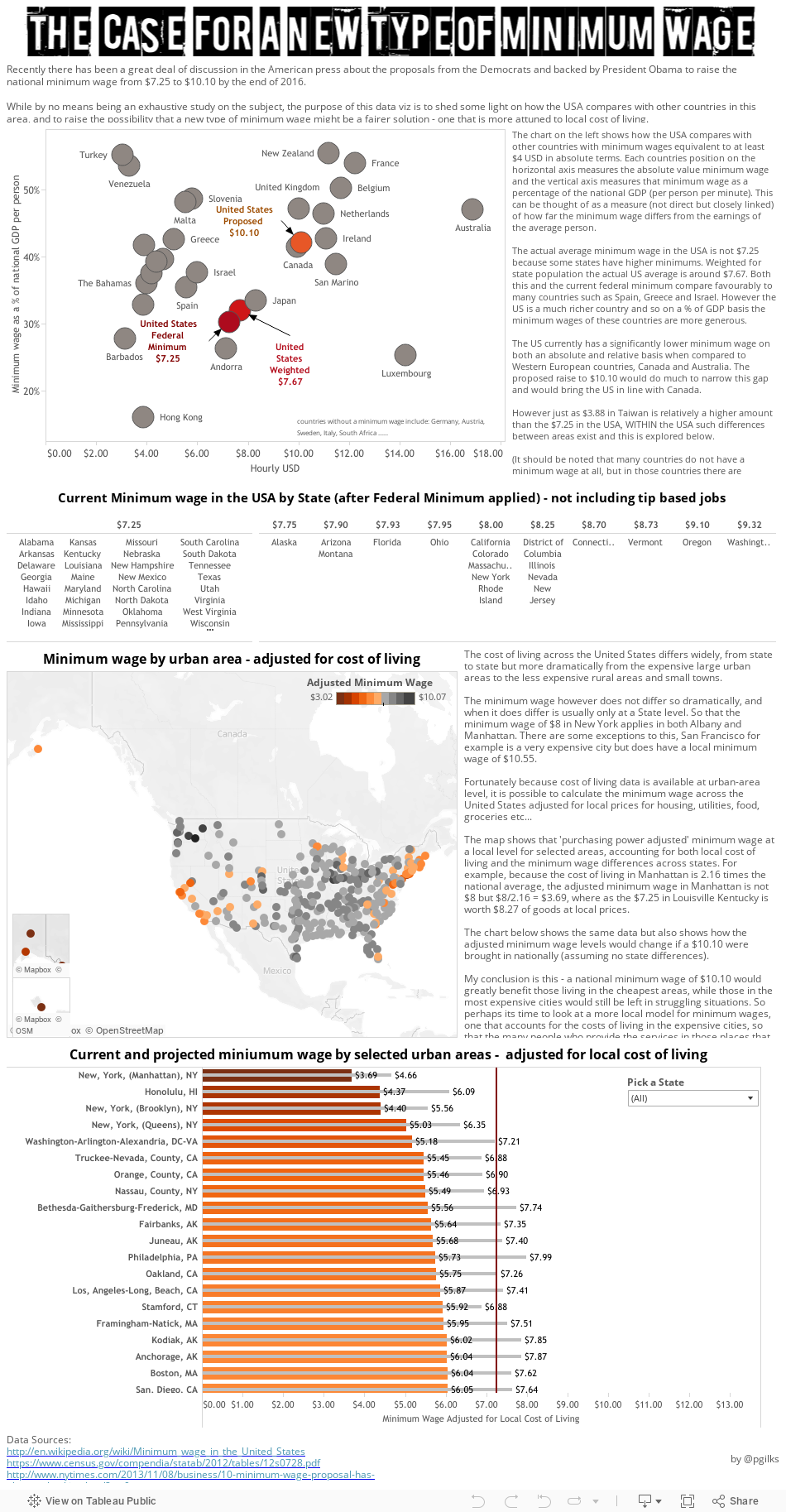
The launch of this site caused me to to consider my own viz output and I decided to attempt to address an issue I think is very important - that of the minimum wage, which is low in many places but in my opinion is scandalously low in the place I now live - the very expensive city of New York.

This has been quite a change and a challenge for me as I usually produce work on my blog that could be considered 'fun'. And its ended up being quite text heavy. But I hope you find it interesting and thought provoking. As usual, comments are welcome.


Sunday, 16 February 2014

Tableau Tip - The End of Time.... series based calculations

OK time for another little Tableau tip which might come in useful. This is one I now use all the time. The idea of using an index to hide time based values was first brought to my attention about 18 months ago by Tom Brown of The Information Lab (if I remember correctly - there is a chance it was Craig Bloodworth or Andy Cotgreave but I'm pretty sure it was Tom).

The situation is this: You've got a time series based table calculation going on that you are interested in showing, something like a running total, YTD total or difference from last month, however you don't want to show all the data - instead you only want to show the latest month.

Your starting position might look something like this below, with year, month, sum of sales, monthly difference in sales and running total.


Now lets say you only want to show the latest month, in this case December 2013. Well the first thing that springs to mind might be to filter, but that messes with the calculations PLUS its not going to automatically update to the latest month when the data updates:


Now the next idea you have might be to HIDE the 'non latest month' data, and that will solve the issue of the filters messing up the table calculations, but its still going to leave you with a problem when you get a new months worth of data you want to automatically show. So this is what you can do....

First create an index field:


now make this discrete


then pop the index field into your viz just after the 'month' pill


now comes the clever bit. To show just the latest month you want to hide everything else. To do this you need to make the Index value along side the latest month be equal to something unique and that will stay constant as the data updates, and then hide everything else. One way to do this is to sort year and month descending, and then highlight all the index fields that are not 1 and click hide. This can work fine for calculations of difference along time BUT does not work for running sums as it flips the year around to calculate from December running to January. So the safe bet is to take the following step:

Create another calculated field that looks like this


this creates a Boolean True/False variable that you can now add to your view and hide the Falses:


then unclick 'Show Header' for both 'index' and 'index match'


and you are left with the view you want, which will automatically update to the latest month as your data refreshes:


And then you can do what you want with that view, change the aliases, add it to a dashboard etc....


If anyone has an alternative approach to this I would love to hear what it is, as with so many things in Tableau there are probably multiple ways to achieve the same goal.


Tuesday, 21 January 2014

Crowdsourcing - The World's Biggest Stadiums

OK so here's a viz I made just because I felt like it :-) No other reason at all.

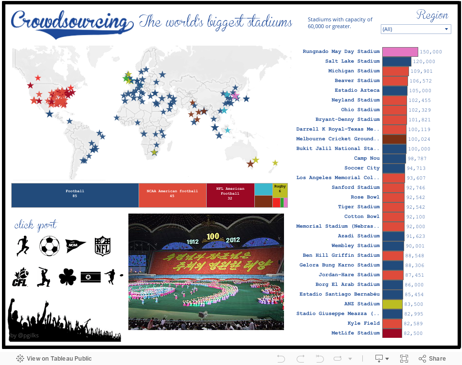
Its looking at the biggest stadiums (or stadia if you like) in the world, specifically those with a capacity of at least 60,000. You can hover and filter to select different sports and regions, and a picture of each stadium should pop up.


A few things I noticed from the data:
1. College football stadiums in America are HUGE. They make the NFL stadiums look tiny. Think about this for a second - these are teams run by institutions of higher education with unpaid players and there are some 46 teams with seating for over 60,000 people. The biggest, Michigan Stadium, is the third biggest stadium in the world. The Premier League by comparison has 2 teams that meet this criteria.
2. I was surprised by the lack of baseball stadiums. I guess it has to do with the shape and size of the field. The biggest baseball stadium is Dodger Stadium with a capacity for 56,000.
3. There are big stadiums really all over the world. There are loads in Africa and Asia, and pretty much everywhere. There are definite regional differences between the sports enjoyed, and these become obvious in the map. The UK is probably the country with the greatest diversity of sporting venues at this level.
4. I'd quite like to go to the 'Mass Games' in North Korea, its probably quite a sight!


Peter

NB - I lumped Rugby Union and League together, sorry if that bothers anyone. Also I tried to pick the 'primary' sport for each venue but may have got this slightly wrong, if you spot a mistake, please let me know.


Thursday, 16 January 2014

Copy and Paste within Tableau is your friend

Ok here's an admission. Table Calculations sometimes confuse the heck out of me. However I've developed a few little tricks I use to make life easier. Here's one I utilised in my latest Tableau Public viz.

Lets say you've been using the cool new Rank feature in Tableau 8.1 on loads of fields, but then you want to filter your data and NOT have the ranks recalculate. What do you do? There are probably many ways to skin this cat, however here's the one I used. It may not be the 'best' way, but I like it. As usual I'm going to use Superstore Sales data to demonstrate.

First I'm ranking all countries by four fields:


Ok good, and I've sorted by the rank of Discount to make the order clear. Now I tidy things up a bit and add a quick filter on country:


Now you see I've de-selected a few countries, and they have disappeared from the view, but the rank has re-calculated. That's expected behaviour, but in my case I didn't want the ranks to recalculate. So here's what I do to fix the rankings (I think of this like doing a copy and paste values in Excel when you want to stop the formulas from calculating).

First, put everything back in the filter.

Then hit CTRL+C

Open a new worksheet

hit CTRL+V

and bingo I now have a new hard-coded data set from the clipboard!


This data set includes only four fields:
Country
Measure Names - Rank of Discount, Rank of Profit, Rank of Sales, Rank of Shipping Cost
Measure Values - the original 'hard-coded' ranks for each
Number of Records

So now when I filter out countries, the countries disappear from the view but the ranks stay as they were:


and then this can be easily brought into a dashboard along with the main data set by using data blending on country.

And all's well that ends well.


Wednesday, 15 January 2014

Comparing University League Tables

Today's Viz of the Day http://www.tableausoftware.com/public/gallery/more-net-costs by Jon Boeckenstedt of Higher Ed Data Stories, which shows the relative costs of US university tuition, got me thinking about doing a viz on UK universities. Since they all basically charge the same price I was going to have to look at something other than fees (though there is a rather sad story in the trend for increasing UK tuition fees overall, perhaps a story for another day).

Here's the viz:


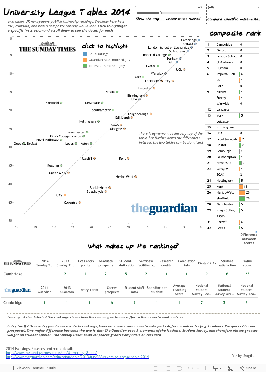
The main story is that at the very top end of the tables, both newspapers are in complete agreement with each other - Cambridge, Oxford, LSE and St Andrews making up the top 4 for both. After that, the two begin to differ leading to a maximum ranking difference of some 43 places for Anglia Ruskin University.

Creating the composite rank was fairly straightforward using Tableau's new RANK function in version 8.1. I simply averaged the two ranks, and then ranked that average! A note on ranking styles - The Guardian uses 'competition ranking' (e.g. 1,2,2,4) where as The Sunday Times ranks are unique. For the composite rank I used competition ranking.


PS - do you believe for one second that St Andrews should be above UCL? Treasonous if you ask me.


Friday, 27 December 2013

Taking a little inspiration from Hans Rosling

Inspired by the recent announcement that Hans Rosling will be speaking at TCC14, a few of my colleagues at Slalom decided to have a little contest to see what Tableau vizzes we could up with inspired by the man himself.

First up we have a collaborative viz made by me and Nelson Davis (@Nelsondavis) which uses the visualization style of GapMinder and applies it to NBA franchises. Nelson did an absolutely awesome job styling the viz with NBA logo's etc... so check it out on his blog:

http://thevizioneer.blogspot.com/2013/12/if-hans-rosling-could-dunk.html

Another colleague Daniel Montgomery (@datapsientist) took subject matter inspiration from Hans in terms of social good and shows how nuclear power can help the fight against pollution and climate change.

http://datapsientist.blogspot.com/2013/12/nuclear-powers-effect-on-carbon-dioxide.html

Enjoy! And make sure you get to see Hans at TCC14, I saw him at TCCEU13 and he was hands down the best key-note speaker I have ever seen.

http://tcc14.tableauconference.com/seattle/