
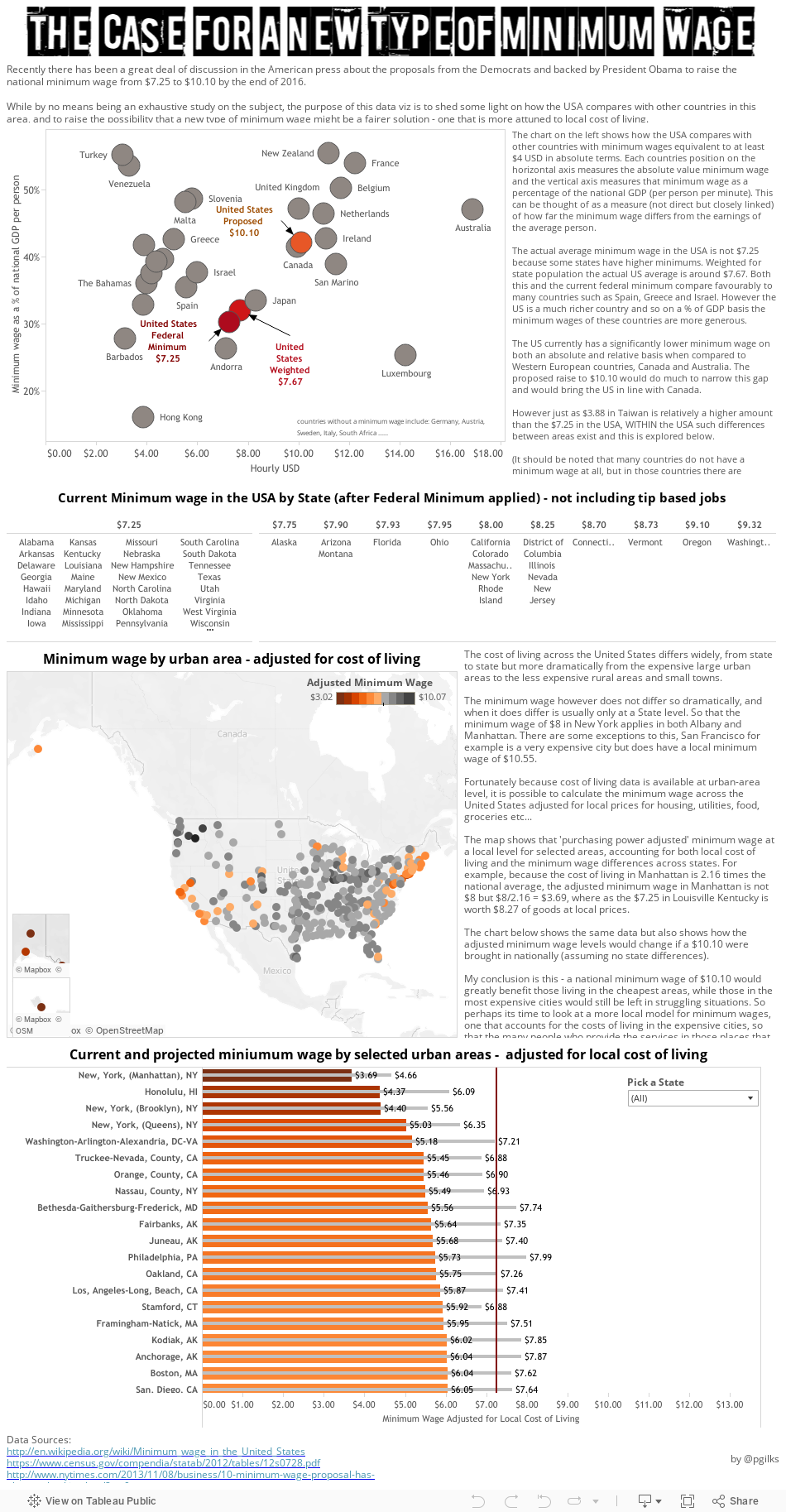
The launch of this site caused me to to consider my own viz output and I decided to attempt to address an issue I think is very important - that of the minimum wage, which is low in many places but in my opinion is scandalously low in the place I now live - the very expensive city of New York.
This has been quite a change and a challenge for me as I usually produce work on my blog that could be considered 'fun'. And its ended up being quite text heavy. But I hope you find it interesting and thought provoking. As usual, comments are welcome.
This comment has been removed by a blog administrator.
ReplyDeleteWhat this analysis fails to take into account is the actual impact of a minimum wage. An increase in the minimum wage does not mean that low-skilled workers will suddenly get a raise, it means that if they do not have the skills to provide benefits to their employer that exceed the now higher cost of their employment then they will become unemployed. If that is not the case then let's stop messing around and really help these folks out by raising the minimum wage to a thousand dollars an hour.
ReplyDeleteIn Point 3, did you notice how difficult it is to select some of the marks in Alaska due to the zoom controls? Tableau annoyance!
ReplyDeleteI wanted to be able to identify the lowest adjusted minimum wage points, but I couldn't find a way. That is what most interested me, but I was unable to locate the points with the lowest adjusted wages.
Good stuff--thank you for sharing, as always!
Hi Matthew, thanks for the comments. In the original version there is a hover to highlight action between the last chart and the map which would help locate the lowest wage points. On looking again this could be improved.
DeleteHowever this also makes me think about the difference between a single dashboard and story points where by its nature its harder to develop interactivity between different views, as they are split up. I haven't yet got my head around how to utilise story points fully yet.