Wednesday, 3 December 2014

Guest Post! A look at the success of the UCONN basketball team over the years

I've  been a bit distracted from blogging recently so new posts haven't exactly been coming thick and fast. BUT you are in luck, because my colleague Chamberlaine Kerr has come up with a cool basketball related viz and she's chosen this as the place to debut it.

Chamberlaine also works for Slalom Consulting and is helping to drive growth of the data visualization practice at our Hartford office. This is Chamberlaine's first foray into the world of Tableau Public and I think its a good one. You can find her on twitter as @ChamberlaineK


Chamberlaine Kerr
Slalom Consulting – Business Intelligence
Hartford, Conn.


In February, 2012 I started my career with Slalom Consulting at our headquarters in Seattle. After roughly one-and-a-half years I relocated to Hartford, Conn., and joined Slalom’s Information Management and Analytics practice.

Prior to Slalom I attended the Foster School of Business at the University of Washington – go Dawgs!   After moving to Connecticut, I quickly realized we aren’t the only Huskies around.  I now refer to my alma mater as the Huskies of the Best (oops! I mean West*) coast.

I’d like to say a huge “thank you” to my Slalom Consulting colleagues Peter Gilks (for allowing me to take over his blog for the day) and Curtis Looney (for helping with the original POC).  Hopefully my own blog will be a part of the not-so-distant future.   In the interim, I want to share the first Tableau viz I created outside of client work – a UCONN Men’s Basketball viz!

The Viz

This past year the UCONN Men’s Basketball team took #Winning to a whole new level as they laughed all the way to the NCAA championship.  The 2013-14 season was UCONN’s 4th NCAA Championship win in the last 16 years … not a bad start for Kevin Ollie’s first year as head coach.
With this year’s college basketball season well underway, it’s a good time to take a deeper look at some of the UCONN Husky’s historical trends.
Please feel free to comment.  All feedback is welcome and much appreciated.  Enjoy!


Wednesday, 5 November 2014

Skyscrapers in New York update

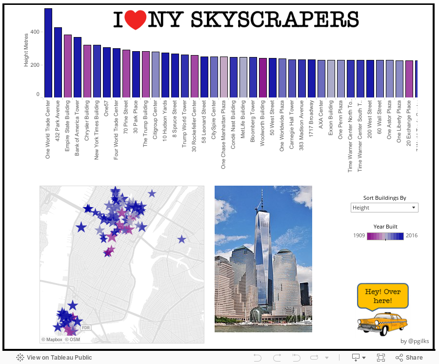
A year a go I made this blog post for Tableau Public Design Month, including a viz on the tallest buildings in New York.

Well over the last year a new very tall building has popped up in the city to take the number 2 spot away from the mighty Empire State Building and so I thought it was time for an update.

The new building is 432 Park Avenue, the tallest residential building in the Western Hemisphere. Its penthouse apartment is currently for sale listed at $95m.

432 Park Ave is part of a new craze for super skinny super tall luxury residential buildings in New York, many more of which are in the pipeline. I'm not really a fan of these new buildings, especially since many of the apartments will be bought and left empty. But whatever happens, I'll try to keep this viz up to date.


Sunday, 5 October 2014

A Rough Guide to Tableau Dashboard Actions

As you probably can tell by now, I really enjoying building data visualisations in Tableau. Whether for this blog or for work, I strive to build dashboards that people will be able to use to explore the data at their own pace and discover their own insights.

One way I attempt to do this is by using, what I hope is, engaging visual design. The other is by building in interactive features into the dashboard that people can play with to start changing the views of the data. This is accomplished in three primary ways: Quick Filters, Parameters and Dashboard Actions. Of these three Dashboard Actions have become my favourite as they are probably the most flexible and offer the most immersive experience. So here's my rough guide to Tableau Dashboard Actions. Its not completely exhaustive, and its not particularly technical,  but if you are fairly new to Tableau, or even an experienced user, I hope you will find it a useful guide.


What is a Dashboard Action?

A dashboard action is an interactive element on a Tableau dashboard that is driven from the worksheets within that dashboard. There are three types of dashboard action:
 - Filter
 - Highlight
 - URL

Tableau themselves provide a good run down of how to build in Dashboard Actions here http://onlinehelp.tableausoftware.com/current/pro/online/mac/en-us/actions.html. So rather than repeat what Tableau have already documented, I am going to show a variety of use cases for using Dashboard Actions and how to implement them. Those use cases are:

Use Case 1: Basic Chart to Chart Filtering
Use Case 2: Pre-Filtering a Large Table
Use Case 3: Creating a 'Cross-Blend' Filter
Use Case 4: Showing Images
Use Case 5: Dynamic Text or Titles
Use Case 6: Linking Out to Web Pages
Use Case 7: Highlighting and Labelling
Use Case 8: Switching Dashboards
Use Case 9: Mixing Things Up


Monday, 22 September 2014

2014/15 Zen Master

A couple of weeks before the Tableau Conference I received this rock in the post and it made me very happy!


I feel very honoured to have been selected and to be in the same group as all the wonderful people listed here http://www.tableausoftware.com/ZenMasters

Thank you to anyone who nominated me, I really do appreciate it and I am so happy to be involved in this community.

OK, better start thinking of my next blog post......


Tuesday, 26 August 2014

Why Does It Always Rain On Me?

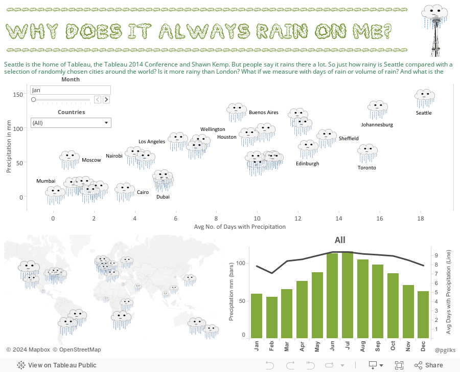
We are now only a couple of weeks away from the 2014 Tableau Conference so I thought I would make a viz in honour of Tableau's home and the location of the conference this year, Seattle. Two years in row is a tradition right? Here's what I did last year

I ruled out making a Seattle Supersonics viz as it seemed just too morbid, so I went for one of the other things that Seattle is famous for - rain!


A few things I spotted in the data:
 - London is nowhere near as rainy as its reputation. When I moved from London to New York I was convinced it was raining here more, and it turns out the data backs me up. Time to lay off the London weather jokes.
- Seattle does deserve its reputation for rain. It doesn't rain the most in terms of volume, but it does rain often.
- The rainy and dry season patterns of some places like Cairo and Mumbai are more extreme than I had previously thought.

I hope you enjoy exploring the viz, and please don't be offended if your city isn't on there, it was a pretty random selection apart from Sheffield where I grew up and it felt like it rained all the time.

Comments welcome, and hope to see you in Seattle! You probably won't need an umbrella in September.


Wednesday, 30 July 2014

Turbo Tip - solving an issue with Excel not opening due to Tableau add-in

The Tableau Excel add-in in and data reshaper is a fantastic little tool http://kb.tableausoftware.com/articles/knowledgebase/addin-reshaping-data-excel
however with some combinations of versions of the add-in and Office it can cause an issue to occur where it becomes impossible to open Excel files from simply double clicking, from within an email for example.

To fix this, use the following tip courtesy of Chuck Hooper (http://www.bialytics.com/).

In Excel go to File->Options->Advanced, scroll down to general and un-check 'ignore other applications that use the Dynamic Data Exchange (DDE)' and that should fix the issue.

Thanks Chuck!


Peter

Tuesday, 8 July 2014

Minimum Wage - the Story Points Edition

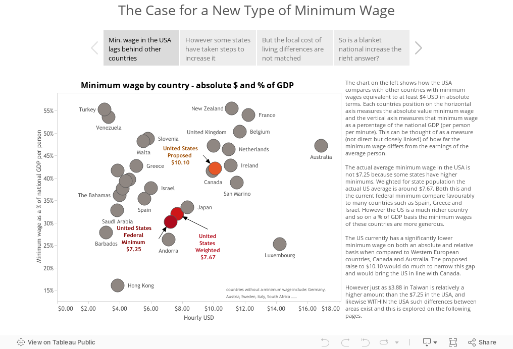
Tableau version 8.2 recently launched and along with the long awaited Mac release (yay!) one of the main new features is something called 'Story Points'. The idea behind this feature is in Tableau's own words "a way to build a narrative from data".

So I decided to try it out and re-work one of my recent vizes into a story, using my Mac of course. I chose the minimum wage viz because it already fit into a story. The original is here, let me know what you think of the differences between the two.


A few of my early thoughts on the new Story Points feature:

To be honest, when story points was announced, I was a little skeptical for a few reasons. I’ll address each of these below.

1.       The functionality isn’t that different from having multiple tabs in a published Tableau workbook, and I know from experience that people don’t often click past the first tab in that environment so I wondered if this would be any different.

I am however seeing how story points works pretty well in leading people through the vizes. The simple and clean design change of having the story point headlines clear across the top does I think engage the viewer enough to want to click through to the next page. It also sets in the mind of the author more of an impetus to create that connected story, rather than just a series of seemingly disconnected dashboards.

2.       Its applicability in an enterprise setting seems niche, and there are other developments that perhaps should have taken precedence over this in the release cycle.

My initial reaction to story points was that it will be great for Tableau Public and for data journalists, but will have limited appeal within businesses where timely, accurate reporting is still a high priority and powerpoint rules the roost for sharing stories. I think this will be the case for a while, but I am interested to see how the use of story points develops in a large business setting as Tableau Server becomes more mainstream and business users begin to experiment with the tool.

3.       Creativity is limited compared to the single dashboard approach.

This may seem counter-intuitive, but I believe that the design thinking behind producing a single screen dashboard that allows the user to explore a story at their own pace requires a greater amount of creative thought than the creation of a guided story. I am a big fan of ‘seeing everything in one place’ and so for me story points doesn’t create that same excitement I get from seeing the single stand-out viz. Having said that, there is already some great work going out on Tableau Public so my mind is starting to change (see these examples by Matt Francis and Carl Allchin). And I’m sure that people are really going to start pushing the envelope with it as it becomes more familiar.

On a more tactical note, the current version of story points is quite restrictive in the design options available. As you will have seen from my viz designs, I’m a big fan of using images, shapes and custom fonts to add to the overall look and feel of a dashboard and help unify the theme. This is much less possible with story points as I can’t use an image for the title, and those grey boxes are very restrictive in size, color and font. Also the grey boxes suffer from a mismatch between how the words fit in desktop and how they look once published.

4.       It has been billed in some quarters as ‘the power point killer’.

I don’t see this happening for a long time! Don’t get me wrong, I love the idea of more people using Tableau to present, and when you are presenting a data heavy story I do think that Tableau story points will catch on. The main problem though is Tableau is not really designed for those ‘non-data’ elements, such as images and text. In fact to get my dashboards looking just right I often do a lot of design and creative work in powerpoint before exporting images into Tableau.
Microsoft have I think done a really solid job in improving the design functions of Powerpoint and that’s going to be hard for Tableau to compete with. And actually I don’t think they should compete on that front. In the future I see more of a split in presentation tools, Powerpoint will still exist but Tableau will be used in some more situations, as will other popular tools like Prezi.


Overall I like this addition to the Tableau tool set, but I feel its a work in progress and I expect the community and many great Tableau Public authors will help steer its development.