Tuesday, 30 April 2013

Guest Post - Floating Dashboards and NBA Player Comparisons

This week I'm featuring what I hope is only the first of many guest posts by @datajedininja, otherwise known as Carl Allchin. A fellow NBA and Tableau nut......


It’s NBA playoff time which means anyone who sees me day-to-day will expect more mood swings than a teenager! If the Spurs are winning then I’m insufferably smug. Yet, if the Spurs are losing then I’m insufferably grumpy.
Using Tableau has become somewhat a way of life for me and there is not many of my interests that I don’t analyse from a data perspective; analysis of the NBA is no different. I wanted to understand how players perform in regards to not just the league but also their own team. Below is a quick walkthrough of how I have achieved this without having to create a large number of weightings that sway bench-warmers in to allstars or give the reader migraines trying to decipher – I’m looking at you Hollinger!


Sunday, 21 April 2013

A handy use of Attributes in Tableau - colouring waterfall charts

For a long time I've noticed the choice of making a Tableau field an 'Attribute' (as below, between Dimension and Measure) once it is in the view and not really known what to do with it, or had the need.


This week I found myself in a situation where I needed to use a Dimension in Colour, without that Dimension splitting up the view, and discovered one example where the 'Attribute' really comes into effective use. So here's the story:

I was making a waterfall chart at work based on some sub categories and needed to add the category one level up as colour. Since I can't divulge the actual data set I was working on I thought it might be useful to show a similar example using Superstore Sales. If you haven't made a waterfall chart yet in Tableau I'm not going to describe the process here but the online training video is very clear http://www.tableausoftware.com/learn/tutorials/on-demand/waterfall-charts-chart-type-8 . Below is the basic waterfall chart of profit split by product sub-category from Superstore Sales, just as shown in the video. Only I've sorted the categories by ascending profit.


Now in the video they go one step further and colour each bar red or green depending on whether the profit is positive or negative. In my case however I wanted to colour the bars by the categorisation level one level up, in the case of Superstore Sales simply Category. So the obvious thing to do is to drag Category into Colour on the marks card. But then this happens.....


....Eeeek! That's not what I wanted. So what's going on here is that the running total calculation is now being separated for each Category. In other words placing Category into Colour didn't just change the colours of the bars, it also added a an extra dimension by which the calculated fields would be based. So how do we get out of this conundrum? Well it turns out the easiest way is to change Category from a Dimension to an Attribute. Just right click on the marks card and select Attribute.


And that solves the problem, see below, and everybody's happy! The sub categories are coloured by category, but the structure of the original waterfall chart stays intact.


 Now I don't think I've fully realised the potential of how Attribute can be used, but this has certainly opened my eyes to how I might be able to use it effectively in future. Essentially any time where adding a Dimension to add visual clarity is also going to split the data set in way you don't desire, changing that Dimension to an Attribute might solve the problem. I'd suggest if you are interested in this then have a play with the function using all the different chart types, for example see what it does to packed bubbles:


Sunday, 7 April 2013

Demonstrating how Logarithmic Scales work, with the help of Chillies and Hot Sauces.....

Logarithmic scales are a very useful device when analysing data, but many people shy away from using them as they can sometimes be difficult to explain. Despite this, logarithmic scales are often quoted in common use, for example the Richter Scale for measuring the magnitude of an earthquake is a base 10 logarithmic scale that is part of the everyday vernacular. (For a good introductory read on Richter Scales and the measurement of earthquakes I recommend Nate Silver's book The Signal and the Noise).

Here I will do my bit for the understanding of Log Scales and will use the example of the heat of chilli's to show both how they work and why they can be useful in data visualisation.


So how do Logarithmic Scales work? Well wikipedia says this "The logarithm of a number is the exponent by which another fixed value, the base, must be raised to produce that number." 


If we take the number 10,000 and we use the base 10, to get from 10 to 10,000 we must raise it by the power 4: 104 = 10,000, so the logarithm of 10,000 is 4. Likewise the logarithm of 100,000 is 5, the logarithm of 1,000,000 is 6 and so on. Not all logarithmic scales use base 10, any base is possible, but it is the most commonly used. (The base 2 logarithm of the number 16 for example is also 4 because 24 = 16).


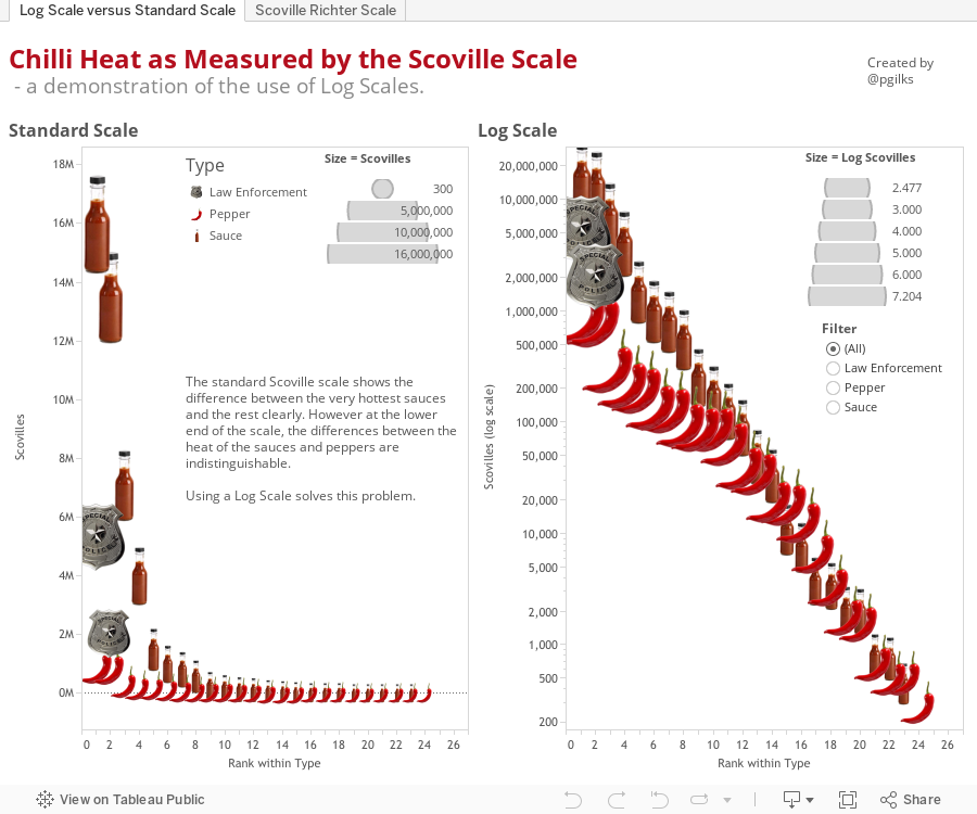
So how do we use logarithmic scales in data visualisation? Take a look at the first tab of the viz below. You will see two charts side by side, the first shows a selection of chilli peppers, hot sauces and pepper sprays mapped by their number of Scoville units. Scoville units are a measure of heat in food, for more information on the Scoville Scale take a look at http://en.wikipedia.org/wiki/Scoville_scale .


The vertical axis shows the number of Scoville units for each item, and the horizontal axis simply ranks the items within their categories (so the hottest sauce and pepper are both at place 1 on the scale). This first viz is quite useful, we can tell straight away that the sauce 'Blair's 16 Million Reserve' is way way way hotter than most of the other sauces and peppers. And for anyone who has ever got chilli in their eyes, you can also see that getting hit in the face with pepper spray probably isn't much fun. However what's harder to distinguish are the differences between the sauces and peppers at the lower end of the scale. For example the Pimento pepper is a lot less hot (by a factor of at least 10 in fact) than the Jalepeno, but its hard to tell on the standard scale.


This is where the logarithmic scale comes into its own. Tableau uses the base 10 logarithmic scale as its default, and you can see on the second viz that this has been applied on the vertical axis. Now the differences in heat (as measured by Scovilles) are much clearer, all across the scale. You can also see how using a log scale might come in useful when trying to identify patterns and relationships. When a variable is working on a power scale, using the log makes spotting relationships much easier.


This work then led me on to thinking about a possible adaptation of the Scoville scale to make it more like the Richter scale. The second tab in the Tableau viz above shows how this might look, using a base 10 log to give each pepper, sauce or spray a score. This has now become a linear scale where one movement in the scale implies a 10 times increase in heat from the chilli. I've got a feeling the sauce buying public might quite enjoy this system of measurement, imagine buying you hot wings on the same basis as people measure earthquakes? For now I'm going to call this the Scoville Richter Scale on which Original Tabasco scores a 3.6, Franks Red Hot a 2.7 and Habneno peppers a 5.4. It looks like the 7.3 score of Blair's 16 Million Reserve might be the hottest score possible as its made from capsaicin capsules (http://en.wikipedia.org/wiki/Capsaicin) but you never know.

Notes: Data for this viz was sourced from a number of websites, mainly wikipedia and http://www.chilliworld.com/FactFile/Scoville_Scale.asp . Where peppers are known to have a range of Scoville scores, I've used the mid point. The list I've presented certainly isn't an exhaustive list of sauces or peppers. And for the record, I'm a bit of a wuss when it comes to hot food, I probably wouldn't venture beyond a 4.5 on the Scoville Richter Scale.....


Saturday, 30 March 2013

Elite 8 Viz Makeover

UPDATE: I made it into the Elite 8, as the 8th seed. Very happy with that result, thanks Tableau judges! If you'd like to see it in context click here http://www.tableausoftware.com/public/elite_8_bracket

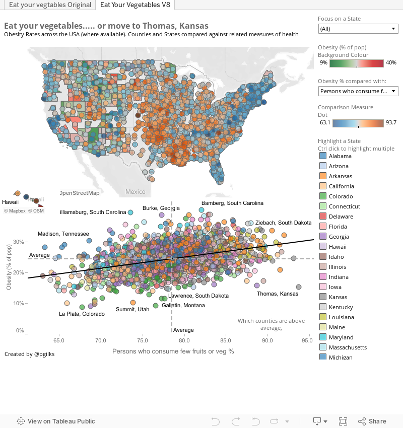
Well Tableau have launched a competition to make over in Tableau 8 one of the vizes previously built in Tableau 7 and published on the Tableau Public Gallery. http://www.tableausoftware.com/public/elite-8   Below is my effort.

My understanding of the competition (which may be wrong!) is to give the viz a makeover, rather than a complete redesign from scratch. So I've kept the basic format of the original, map followed by scatter plots. Plus I love scatter plots!

I've actually not used too much of the version 8 functionality in this instance as I didn't think that the new chart types for example would be relevant to this data set. Instead I've tried to open up the dashboard a bit, to show the national picture, to make comparisons between states and counties easier using colour and, as with my NBA viz below, to make it easier to spot outliers. I've not sized the bubbles as I don't like to repeat measures in bubbles, I would have sized by population if available.

One thing I have done with the new functionality is use the floating tiles quite subtly, allowing Hawaii to appear in the national picture, and placing a decent paramter based x axis label in the scatter plot.


Content wise, most of the links with obesity are well known. lack of exercise and poor diet lead to obesity, which in turn leads to health problems such as high blood pressure. this is well known and established so I didn't think there was much point trying to emphasise this too much (though it is there). Most interesting to me are the geographic differences, especially the outliers. For example, what are folks in Lawrence Kansas doing to stay trim? There are two tabs. One shows my version in Tableau 8, the other shows the original.

Comments?

NBA Quadrants redux

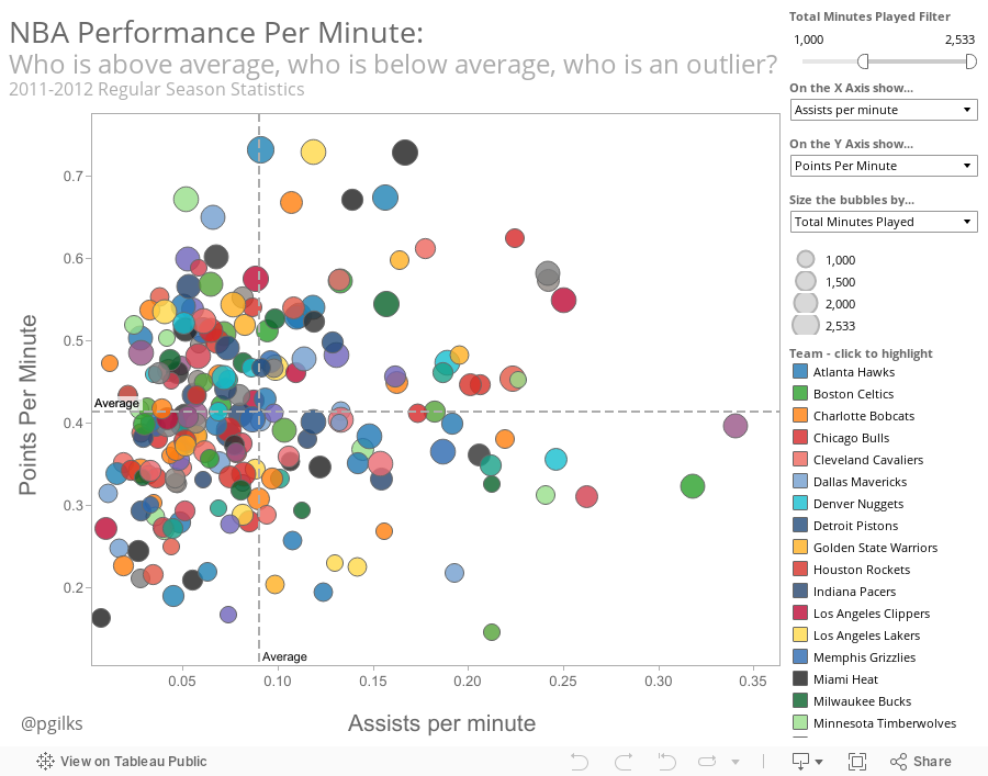
So its been an awful long time since I first posted a viz on here, but I'm getting back on track, starting with an improved version of the NBA player stats per minute comparison quadrant.

What really appeals to me about showing NBA player data in this format is the ease with which comparisons between players can be made on an even playing field, and players who are statistical outliers really stand out.

Since I posted my first effort I've learnt a lot more about Tableau, and hopefully this shows.
PS apologies for the weird alignment, haven't figured this out yet!


Sunday, 30 January 2011

First post, here goes nothing.....

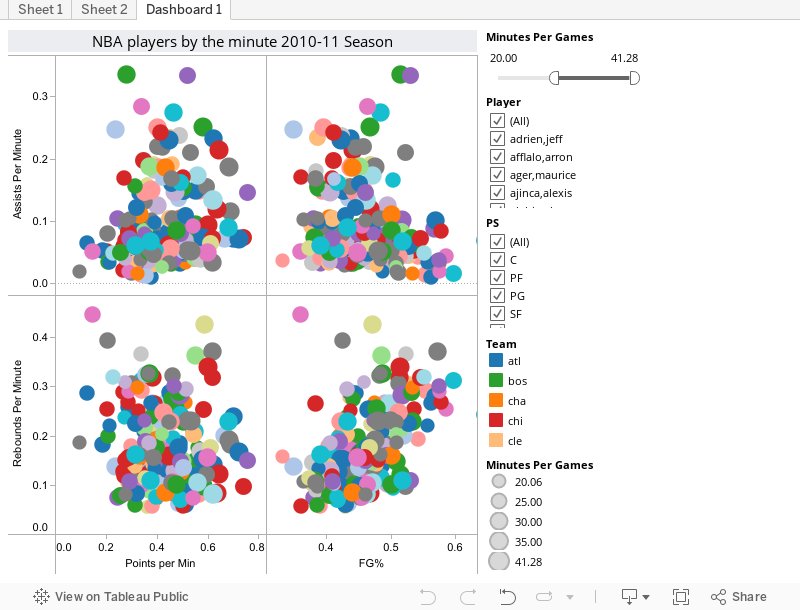
Well here is my first post, its a data viz created in Tableau Public showing a different way of looking at NBA player stats for the 2010-11 season as of 30 Jan. I've cut the major categories (points, rebaounds, assists) by minute and added in FG% to get a view of the most productive players, regardless of playing time.

Its interactive so go ahead and filter by position, highlight players or teams and have fun...