
To demonstrate I'm going to use NBA player data from the 2012-13 season, and I want to show which players are good at shooting 2 point shots, 3 point shots, both or neither. To do this in a way which will change when the data changes I need to first create a calculated field that will represent the average across all players (and act as a constant) for both shot types. The easiest way to do this, that I've found, is to place the fields out in a list and then run window averages along side. Placing them in a table in this manner is a good way to check that what you think should be happening is happening!


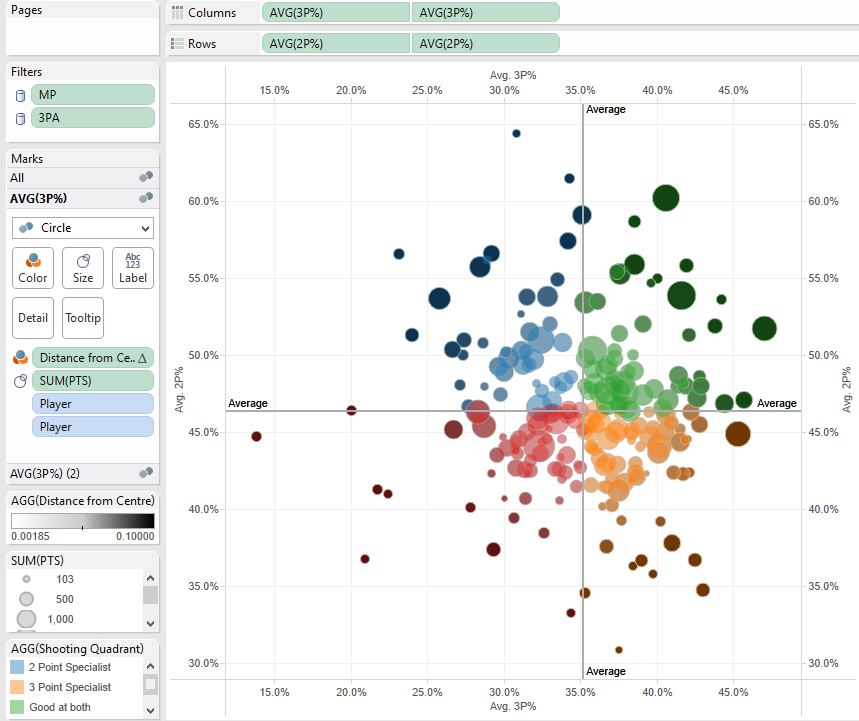
So I'm using window_avg calculated along Player. At this stage I then write a calculation to place each player into one of four groups depending on how they perform compared to the average, and place this calculated field onto colour to test its working:


Hitting the scatter plot icon on show me and then rearranging the fields a little results in this diagram, where you can clearly see the four quadrants:

Ok good. Now what I want to do is create an effect to show how far into each group each player is, so that players who are, for example,very deeply in the 3 specialist quadrant are represented in a darker orange. My inspiration for this idea came from Will Jones at Interworks who as far as I know was the first person to try dual axis colour http://www.interworks.com/blogs/wjones/2013/09/18/create-dual-color-axis-tableau
In my case I want to base the colour saturation on how far each player is from the overall mean in two dimensions, and so a bit of Pythagoras comes into play:

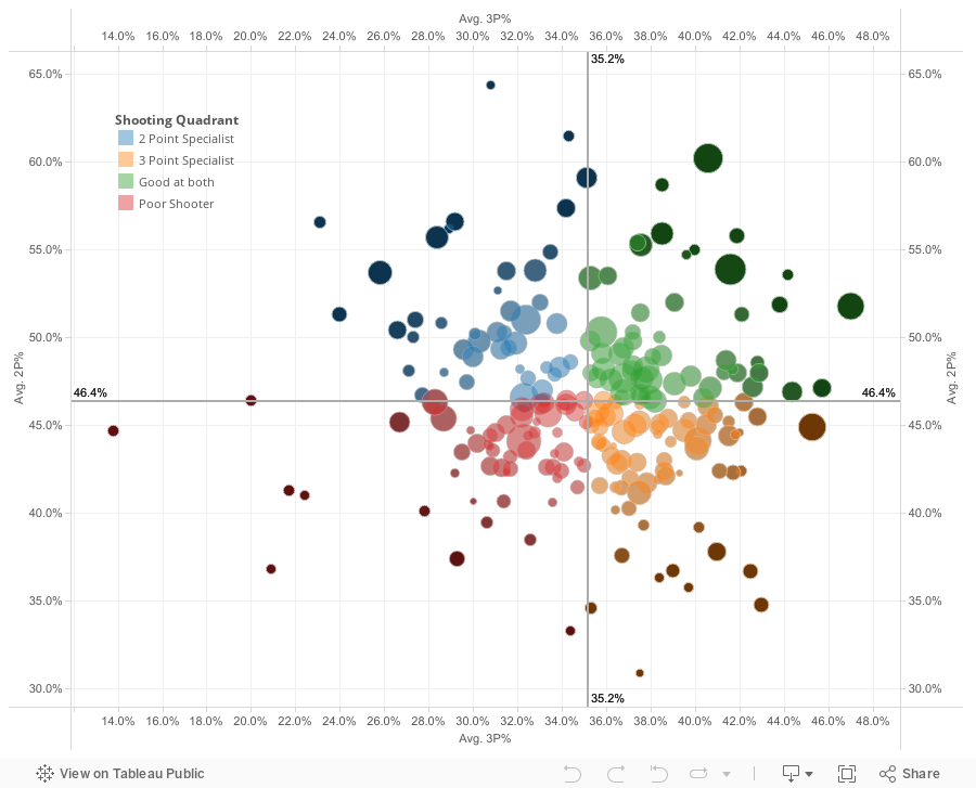
Then duplicate the rows and columns and make these dual axis, and synchronise the axes too. The key then is to make the top layer of scatter circles slightly transparent (around 70%) and then colour the bottom layer on a white to black scale based upon 'Distance from Centre', like so:

I changed the end point on the scale to account for outliers. Then add some reference lines for info and you are done! Here's what the finished product looks like, feel free to download and have a play,
Peter
Hi Pete, I really like this method and the combination of different techniques. As a serial worshiper of scatter-plots, this adds an interesting dimension :0)
ReplyDeleteThanks Lee. Scatter plots are hands down the best chart type by far.
ReplyDeleteIt would be ace if this has a 'position' filter...
ReplyDeleteexplain further....
DeleteNot sure if he means player positions (Center, Pt Guard, etc) or position from the mean? Cool technique, and thanks for blogging about Tableau!
DeleteThis comment has been removed by a blog administrator.
ReplyDeleteThanks for this technique! I just used this with a set of scatter plots and it's awesome. I gave you a shout-out on my blog post:
ReplyDeletehttp://evankepner.com/looking-at-obesity-and-socio-economic-indicators/
Hi Evan, really pleased to see you found use for this technique and I enjoyed reading your blog post. Thanks for letting me know and for the shout out.
DeleteThanks for giving information please check the link http://www.sqiar.com
ReplyDelete