Sunday, 28 July 2013

Tableau Public Social Media Contest - my entry

Tableau Public have launched another viz competition, this time asking entrants to come up with viz's based on social media. Here are the details http://www.tableausoftware.com/public/social-media-contest

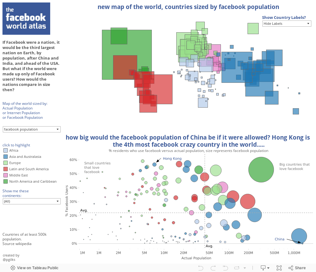
I was having a hard time thinking of how to get to some useable data for niche topics, and in the end decided I could make a better viz by using one of the datasets that Tableau suggested, this being facebook usage statistics by country.

And so I re-drew the map of the world, sizing countries by their populations of facebook users. And for reference you can use the parameter controls to show alternate versions sized by actual population or internet using population. Doing this reveals clearly how big an impact the restriction on facebook in China has.


What do you think?

By the way, the font I used is not the same the one facebook uses, but is similar, the title uses Exo, the body uses Lucida Sans.

Thursday, 4 July 2013

The GRUNT-O-METER. A viz in honour of the tennis at Wimbledon


With Wimbledon coming to a close yet again it seemed timely to produce a tennis themed viz.

In recent years the 'grunts' produced by female players while giving the ball a good whack have garnered a lot of press, so I thought it might be fun to look at the games' louder grunters, and see if their lung power has any impact on their career success. I'll let you take a look at the data and figure the answer to that out for yourself :-)

As with the Hopometer, the idea and much of the design and image sourcing is down to @highline_online.

Here's a recent clip of the top two, cover your ears!

Friday, 7 June 2013

Tableau Worm Charts - a European Conference Special

I can't remember exactly the first time I saw the amazing Hans Rosling doing his thing with global  public health data and moving bubbles (I think someone sent me this link http://www.ted.com/talks/hans_rosling_shows_the_best_stats_you_ve_ever_seen.html about 3 years ago) but I remember how inspired I felt. Hans could have showed that same data with two sets of line charts with time on the x-axis, but instead by making time a third dimension that moves he made the visualisation so much more engaging and powerful.

When I first started using Tableau (also around 3 years ago) one of the first things I tried to do was replicate what Hans Rosling had done with the data I was using at work. And with the Tableau European Customer Conference right around the corner featuring none other than Hans Rosling as a key note speaker, this seems like the ideal time to tell that story, and to introduce The Worm Chart!

I'm going to run through this explanation with a fictional data set, but one that mimics quite well the behaviour I see in my job at a retail bank. The data set includes ages, number of customers, savings balances, customer income and proportion of customers with a mortgage. I want to investigate how those variables change with age.

The first thing you need to do to make a bubble chart of course is produce a scatter plot. So place a Measure onto Rows and another onto Columns:

Next I want to split the scatter plot up into bubbles based on Age. So I next move Age from Measures to Dimensions:

Now if I were to go on and produce a moving bubble chart like Hans, I would place Age into Pages, maybe add some colour and size options and hit play. However most of the time I don't get to show my colleagues a dashboard in a setting where I can press play, often charts get put into Powerpoint and currently Tableau Server doesn't allow Pages to work in the same fluid way as Tableau Desktop. So I found a way to add the impression of movement in a static image. First by adding Age to Colour I can split up the bubbles:
This is still a little unclear, so to make things clearer I change the mark type to Circles, I add number of customers to Size and crucially use the Cyclic colour setting which perfectly shows the gradual changes     as age increases:

It is now very clear how these variables, Income and Savings, are changing with age from the younger ages (green) where both are low, through to middle age (yellow) where income is high but savings moderate and past retirement (pink) when income reduces but average savings increase. This is The Worm Chart! One of the benefits of this type of visual is also how easy it is to spot changes that are out of sync with the usual gradual change. In the example here you can see how there is a jump in savings when customers hit 65, i.e. common retirement age. That kind of jump just doesn't stand out as much in a line chart. You can also spot outliers, like the very young and easily exclude them:

And then maybe throw another Measure onto rows or columns to show two worm charts at once:

So that's the worm chart, its a fun and engaging way of showing data in instances where things change gradually with time and you want to demonstrate the cyclical nature of the data or highlight where it skips.
You can expand on this by adding a top tier dimension into Colour ahead of Age (in Hans Roslings case that dimension would be Country) to create multiple worms in the same pane. And to really take things to the next level produce Parameters to allow users to choose different measures for the X and Y axis. Which is exactly what @datajedininja and I will be demonstrating at #TCCEU13.........


PS - I'm sure I'm not the only person to have done this, so apologies to anyone who's done this for years and is thinking 'so what', but I thought it would be new and interesting to a lot of people.

Sunday, 19 May 2013

Consistency of NBA Franchises from 1974 to now - are Indiana the most boring team?

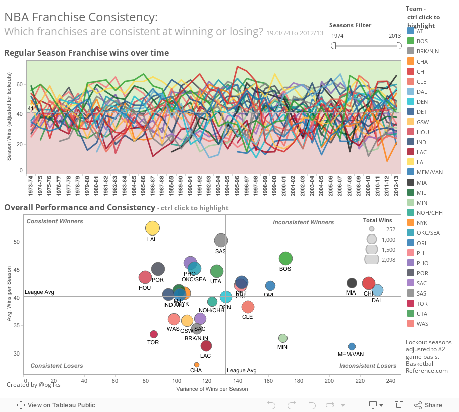
As another NBA season draws to a close, I've started to think a little about what makes NBA success work in the long term. Why is it that some teams (the Spurs) seem to make a deep playoff run every year where as others (Dallas perhaps) go up and down like a yo-yo? Well first I wanted to visualise these differences in consistency to see if my impressions of the different franchises are actually correct. Hence the viz below.

Looking at franchise performance in terms of regular season wins from the 1973/74 season to now, I've used the average season wins and the variance in season wins to split the NBA franchises into four groups:

1. Consistent Winners - These guys win games year after year. Some do it in serious style and end up with titles (like the Lakers), while others plod a long as above average winners, but never go on to wn it all (Phoenix).

2. Inconsistent Winners - The Bulls, the Heat and The Mavericks all embody this trait perfectly. Periods of superstar led brilliance, followed by seasons of regrouping and rebuilding. I was surprised to see Boston in this group.

3. Consistent Losers - Every year these teams seem to perform below par, little surprise this group includes the Clippers and the Raptors.

4. Inconsistent Losers - There are only three teams in this group since 1973/74, the Cavs, the Grizzlies and the Timberwolves. Mostly these guys are in the doldrums, but on occasion something happens (something like LeBron James) to lift them to heady heights.


There is also I think a fifth distinct group, which are really the most boring  teams to follow in the NBA (the stats are saying it not me). I'm looking here at Indiana, Milwaukee, Atlanta and New York. Maybe thats a little unfair to the Knicks because the chat starts just after their last title, but hey that was 40 YEARS AGO! These teams are very consistent, have average seasons of 41 wins and don't win anything.

Which leads to another conclusion. Every team except Orlando in the Inconsistent Winners quadrant has won at least one, and often multiple, titles. But in the Consistent Winners quadrant there are 6 title-less teams. Maybe these results echo the appetite for risk of each team's owners. Some would rather aim for the occasional big win where as others want a consistent winning team but aren't willing to take the risks of crashing and rebuilding. And you have to take your hat off to the Spurs and the Lakers ownership and management for such high levels of consistent performance.

This being a Tableau viz there is of course the option to interact with it, so please go ahead and click on teams to compare, or change the period of time you're looking at. What else can you find?

Below is a screen shot comparing some of the key teams in the 'post Jordan' era.


Since 1999, San Antonio have shown an other-worldly ability to be consistently good, year after year after year with an unending supply of talented and overlooked players*. Other teams like Cleveland have seen their stock rise only to fall off a cliff when a key player departs.

My team is Chicago, I'm just hoping for an injury free season in 2013/14.

* @datajedininja has done an analysis of all the players the Spurs have drafted since 1966, check it out here 


Sunday, 12 May 2013

The Hopometer - Visualising beer strength and bitterness

This week's blog post is a team effort and is all about beer! My wife Heather (@highline_online) is, like me, a big craft beer fan so we decided to collaborate on this viz all about beer strength and bitterness. Plus Heather has much better design skills than me.....

Below are a bunch of mostly very hoppy beers (I love me some hops) plotted by their alcohol content and bitterness as measured in International Bittering Units (or IBUs). Introducing The Hopometer.....

Most of the beers come from a list of the top 100 most bitter beers in the world compiled by beertutor.com http://www.beertutor.com/beers/index.php?t=highest_ibu. And to give some perspective we've also added some of favourite slightly less hoppy beers, along with some popular mass market 'beers'. Are any of your favourites on the viz?

We had to strip out some beers from the top 100 because the massive amount of clustering between 8% and 10% alcohol and 100 and 130 IBU's was making things a bit crowded. And we used a log scale for the same reason. You'll see in this range the beers are mostly from the US, and Double or Triple IPA's dominate in that section.

Here's what About.com says about IBU, I particularly like the Example...

Definition:
IBU - International Bittering Units
This is a measure of the actual bitterness of a beer as contributed by the alpha acid from hops. Because the apparent bitterness of a beer is subjective to the taste of the drinker and the balancing malt sweetness of the beer this is not always an accurate measure of the "hoppiness" of a beer. But, generally speaking, beers with IBUs of less than 20 have little to no apparent hops presence. Beers with IBUs from 20 to 45 are the most common and have mild to pronounced hops presence. Beers with IBUs greater than 45 are heavily hopped and can be quite bitter.
Examples:
Not knowing that the barleywine had an IBU of 68, Rachel took a big swig from the glass then twisted up her face as the hops assaulted her taste buds.

For more info on IBU's the are loads of places to look on the web, but this is a good start http://www.popsci.com/science/article/2013-04/beersci-ibus-explained
All that vizing has made me thirsty.....

Sources: beertutor.com, draftmag.com, general googling....


Quick shameless plug. Heather runs a record label Highline Records, and this is the latest release by The Ralfe Band:


Tuesday, 30 April 2013

Guest Post - Floating Dashboards and NBA Player Comparisons

This week I'm featuring what I hope is only the first of many guest posts by @datajedininja, otherwise known as Carl Allchin. A fellow NBA and Tableau nut......


It’s NBA playoff time which means anyone who sees me day-to-day will expect more mood swings than a teenager! If the Spurs are winning then I’m insufferably smug. Yet, if the Spurs are losing then I’m insufferably grumpy.
Using Tableau has become somewhat a way of life for me and there is not many of my interests that I don’t analyse from a data perspective; analysis of the NBA is no different. I wanted to understand how players perform in regards to not just the league but also their own team. Below is a quick walkthrough of how I have achieved this without having to create a large number of weightings that sway bench-warmers in to allstars or give the reader migraines trying to decipher – I’m looking at you Hollinger!


Sunday, 21 April 2013

A handy use of Attributes in Tableau - colouring waterfall charts

For a long time I've noticed the choice of making a Tableau field an 'Attribute' (as below, between Dimension and Measure) once it is in the view and not really known what to do with it, or had the need.


This week I found myself in a situation where I needed to use a Dimension in Colour, without that Dimension splitting up the view, and discovered one example where the 'Attribute' really comes into effective use. So here's the story:

I was making a waterfall chart at work based on some sub categories and needed to add the category one level up as colour. Since I can't divulge the actual data set I was working on I thought it might be useful to show a similar example using Superstore Sales. If you haven't made a waterfall chart yet in Tableau I'm not going to describe the process here but the online training video is very clear http://www.tableausoftware.com/learn/tutorials/on-demand/waterfall-charts-chart-type-8 . Below is the basic waterfall chart of profit split by product sub-category from Superstore Sales, just as shown in the video. Only I've sorted the categories by ascending profit.


Now in the video they go one step further and colour each bar red or green depending on whether the profit is positive or negative. In my case however I wanted to colour the bars by the categorisation level one level up, in the case of Superstore Sales simply Category. So the obvious thing to do is to drag Category into Colour on the marks card. But then this happens.....


....Eeeek! That's not what I wanted. So what's going on here is that the running total calculation is now being separated for each Category. In other words placing Category into Colour didn't just change the colours of the bars, it also added a an extra dimension by which the calculated fields would be based. So how do we get out of this conundrum? Well it turns out the easiest way is to change Category from a Dimension to an Attribute. Just right click on the marks card and select Attribute.


And that solves the problem, see below, and everybody's happy! The sub categories are coloured by category, but the structure of the original waterfall chart stays intact.


 Now I don't think I've fully realised the potential of how Attribute can be used, but this has certainly opened my eyes to how I might be able to use it effectively in future. Essentially any time where adding a Dimension to add visual clarity is also going to split the data set in way you don't desire, changing that Dimension to an Attribute might solve the problem. I'd suggest if you are interested in this then have a play with the function using all the different chart types, for example see what it does to packed bubbles: