Showing posts with label tableau public. Show all posts

Wednesday, 30 March 2016

What's Peter Been Listening To? My first (mis)adventures with scrobbling


The viz above shows the top 20 artists I've listened to on Spotify so far this year - here's the back story:

For the last few years I've enjoyed reading Andy Cotgreave's blog posts where he takes a look at his listening habits by using data from Last.fm, here's a good example. And of course my pal Jewel has also played around with her listening data too. So I finally decided to get myself in on the action.

I should add also that this last year I've really fallen back in love with listening to music and discovering new bands. I was really into music as a teenager but kind of lost interest. But my Spotify subscription has really helped me get back into it and I probably listen to more new music than ever now - while still listening to all my old favourites.

So, first of all how to collect the data. Its pretty simple:

1) Get a Spotify account
2) Get a last.fm account
3) Link them on ALL your devices
4) Download your data here thanks to Andy's friend Ben https://benjaminbenben.com/lastfm-to-csv/

So to look at my data, first off lets check out the data quality:


As you can see, I've had a few problems. A couple of times last.fm and Spotify got disconnected. I kept an eye on last.fm and noticed it had stopped Scrobbling (Scrobbling by the way is just keeping a record of your listens). And then very recently I realised that it wasn't picking up my mobile listens - I didn't know I had to change the settings on my devices individually.

So I've lost quite a bit of data, but oh well. I'm also not 100% convinced its picking up ALL my Spotify plays.

What else have I seen?

Saturday, 19 March 2016

6 Simple Formatting Tricks to Tableau Like a Boss

Let's admit it right now, formatting in Tableau can be reeeaaalllllllyy tedious. BUT some time spent on formatting is what can turn just another dashboard into something that looks super slick. When I'm working with people who are new to Tableau they often show me their dashboard and ask why it doesn't look like mine - it's all in the details I explain, get the formatting right and your viz will look better immediately.

So here are a few of my top tips for making simple but effective formatting changes in Tableau. Of course you might disagree with these, and that's also fine :-)


1. Lose the lines

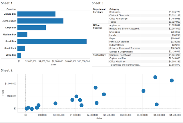
By default, most chart types in Tableau come with axis lines, borders and reference lines. I like to get rid of almost all of these. Say we have this view below:


First I'm going to get rid of the borders by turning off row and column lines:


and do this for all of the sheets. But I am going to keep some row lines for the table, to differentiate between the departments.

Then I also like to turn off the grid lines on scatter plots, most of the time these are completely unnecessary (IMO). To do this you use the paintbrush icon in formatting. I sometimes like to turn the zero lines off too, but not always, that really depends on how important being above or below zero is. In the example below, I'm going to keep the zero lines but make them a lighter tone of grey.


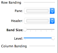
And finally I'm going to lose the row shading from the table by just moving the row banding to zero:


And from just making those simple changes, our dashboard is already looking a lot cleaner....


2. Sweat the fonts

Font consistency is a very important part of giving a dashboard a overall look and feel. Often font choice is limited because of the server you will be publishing to, for example Tableau Public has these fonts available. However that's never an excuse for inconsistency, even if you have to use Arial everywhere. Font consistency does not mean that every word has to be written in the same size or color, but there should not be too much variety - I try to stick to a maximum of three different sizes and two different colors per dashboard. Often those colors will be a black or dark grey, and a color relevant to the topic or company.

BUT here's one thing you absolutely must do with every dashboard!!!!!

For some unknown reason Tableau defaults all fonts to Arial except titles, which it sets to Trebuchet MS. Please, please, please change this when you are changing your titles.


3. Be significant with your figures

Number formatting is a detail that's more important than you might think and should not be overlooked. Always consider "at what level are these numbers significant?" and work from there. For example, if we are looking at the salaries of NBA players, do we need to see the cents? Definitely not. Do we need to see even the dollars or the thousands of dollars? Most likely we don't need to see those either. Which of these do you think offers the best comparison for ease of understanding?


Personally, I would go with Option 4. NBA players are paid in the millions, so who cares about the last dollar? BUT the single decimal place still lets me see that Dwight Howard is paid more than Chris Bosh.

When working with number formats, also consider using different units and decimal places for the axis and the pane. The Axis probably needs less detail than a label or a tooltip.

And don't forget to always include a $,£,€ etc... sign if you are dealing with currency.


4. Create space

Sometimes Tableau dashboards can seem a bit cramped, don't be afraid to use white space, or dividing lines to create separation and breathing room for your charts.

If you are building on completely floating objects, you can obviously control exactly where you want things to go. But I like to use tiles (much to the chagrin of some of my colleagues) because I find it faster to iterate the placement and design and the published version is more likely to look like the desktop version. If you are a tile fan like me, try adding blank tiles between sheets:


Or.... bring in a picture of a line as an image. I simply create lines in powerpoint and save them as .png files. If you are using floating objects, you can bring in a single shaded text box and make it very thin.


5. Hide field labels for rows (and other unnecessary labels)

In the picture directly above you see the title 'Sales by Container', and then also on the chart a field label telling us that we are looking at the Container field. This is completely redundant. Your audience aren't stupid, they know if the title says 'Sales by Container' that they are looking at containers, so hide that field label!


Also, do your audience need to be told that Jan, Feb, Mar etc... are months? That 2014, 2015, 2016 are years? Or that New Jersey, New York and California are States? I doubt it, so save the space and get rid of any and all redundant labels.

BUT that's not to say all labels are bad - you might have two fields in play that are not so obviously distinguishable. And always consider your audience....


6. Labels beat axes

Some might find this tip a little controversial, but I am nearly always a bigger fan of labels than axes, especially for bar charts. There are two reasons for this:

1) If you do want/need to know the number as well as the relative size, its a lot easier to read it at the end of the bar than keep scanning your eyes up and down to the axis.

2) Axes look kinda ugly

So get rid of the header and add some nice labels instead :-)


And there are your 6 simple tricks! Of course there are many more design elements to consider, like color, story, actions, filters, text, pictures, sizing, tooltips, layout etc.... But even with these easy and quick changes we've managed to make our dashboard look a lot more professional than the default view we started with. Don't you think?


PS - apologies to BuzzFeed

Saturday, 5 March 2016

Real Estate of Mind - again

A simpler version of this viz of all New York City real estate sales in 2015, with no story points, no parameters and no quick filters, only actions. Try clicking things....

Monday, 1 February 2016

A few notes on building Real Estate of Mind - All City Edition

In case you missed it here's the viz

Data

I sourced the data for this viz from http://www1.nyc.gov/site/finance/taxes/property-rolling-sales-data.page which gives the latest rolling 12 months. This is a really great source for NYC property data, in fact I think nyc.gov have done a pretty fantastic job all around of making city data public. For historic data back to 2003 you can go here http://www1.nyc.gov/site/finance/taxes/property-annualized-sales-update.page, that might be my next task!

The data comes separately for each borough, so I just downloaded them all and stuck them all into a single Excel sheet, noting the various borough codes (1=Manhattan, 2=Bronx, 3=Brooklyn, 4=Queens and 5=Staten Island).


This dataset includes ALL property sales, including commercial property and entire buildings. So to try and identify which sales were single residential units I filtered to the building categories below and then applied an extra filter to try and pick out apartments versus whole buildings:


I know for a fact that this wasn't 100% successful, but I think it was a pretty good way to filter. I also filtered out the 17,000 sales less than $50,000, because I just don't believe that could ever be real.

One wish I have for this dataset would be better sq ft data, its currently listed for less than half of properties, and bedrom counts.

Geocoding

The data provided by nyc.gov gives street addresses and zip codes, but I wanted to be able to map the building points exactly. Last time I used a geocoding tool by Texas A&M University. This time I searched around again and found a site called geocod.io which seemed to offer a combination of very reasonable pricing with a friendly user interface.

To do the geocoding I simply uploaded a csv file including the street addresses and the zip code. In fact the first time I did it I also included the city name of New York for all points but this put everything in Manhattan. The folks at geocod.io were kind enough to help me out quickly and return my credits, I was very impressed with the customer service they provided.

Now let's talk about accuracy of geocoding. For the most part it was pretty good, but there were some weird results too, for example check out this map showing all points I geocoded:


The zip code 11363 is in Queens, so I'm not sure how this point ended up in Arkansas. Fortunately the few big mistakes are easy to get rid of using the Tableau lasso tool.


More frustrating are the near misses, for example some points ended up in the wrong borough:


and some of the 'famous' high end buildings in Manhattan were in the wrong spot. For example:


I realize this might seem picky, but when you are looking at NYC real estate the $ difference between the top and the bottom of Central Park, for example, is HUGE. I'd say 95% of the data points are pretty spot on, but unfortunately the mistakes do cause some problems, particularly when trying to zoom to a particular neighborhood.

Geocod.io do provide accuracy scores, but sometimes clearly wrong locations (like the wrong state) are scored 100%. Having said that, I would use the service again as I don't think any service has mastered batch geocoding perfectly.

Color

For the design of this viz I wanted to create a unique look and a nice color palette. I searched around for NYC graphics and found this apple, and from here I built out the palette.

To do this I used a site called coolors.co. Its a really nice system for building 5-color palettes. I locked in the yellow, red green and grey from the apple and then hit the space bar to generate the fifth color until I was happy, easy peasy!


Performance

To be honest, the viz loads more slowly than I would like. At first I was using data blending to bring in the latitudes and longitudes, so I switched this to joins to try and speed things up. Unfortunately this didn't work, so I think the slowness is down to the number of mapped points, the use of medians and the high res images. I don't really want to lose any of these, so please be patient :-)

I hope you enjoy the viz, I like doing work with real estate data and will probably do some more in future.

Monday, 25 January 2016

Real Estate of Mind - All City Edition

In April 2015 I made a viz called Real Estate of Mind which looked at residential property sales in Manhattan. Well I decided to come back to that data-set but this time I wanted to expand out to the whole of New York City. And I also wanted to present some of the analysis that's possible when digging into this dataset. So I present Real Estate of Mind - All City Edition!


And here's a dashboard only view for digging right in:


Next time I'll write up a blog post about making this viz and do some analysis of the accuracy of the geocoding (which I'm not that happy with), but right now though I'm exhausted. The data is taken from http://www1.nyc.gov/site/finance/taxes/property-rolling-sales-data.page and the geocoding was done with geocod.io

Saturday, 9 January 2016

BALLCODE 2.0


UPDATE Jan 30 2016: The Kimono Labs scrape stopped working and Kimono provided no support. So I've had to ditch that, and my buddy Andreas helped me out with a Python script for pulling down the data. Thanks Andreas!

If you are a regular and long time reader of my blog (there must be at least 3 of you out there) you may remember a viz I made a few years a go called BALLCODE. It looked like the picture below and was a summary of the whole NBA 2013/14 season. At the time I thought I had come up with an original concept, but it turned out that wasn't the case. None the less I was very proud of this viz and it was even awarded 'most beautiful' tip from Tableau Public.


It also proved to be a very popular viz among other Tableau Public authors and has been the inspiration of a few great vizzes out there (and the lovely authors were kind enough to reference me). See in order of when they came out work by Chris Jones, Matt Chambers and Craig Wortman.


I'm very flattered that these guys enjoyed my viz and wanted to experiment with using the idea and take it in different directions and for different sports. If there's any other examples out there, please let me know.

Now the MLB and NFL are all very good, but they aren't a real sport like basketball, so I wanted to do my Ballcode viz again. In fact I intended to do it again at the end of last season but forgot. And now with the Golden State Warriors tearing up the league in an historic way, I didn't want to wait to the end of the season to start showing their streak.

So..... for Ballcode 2.0 I am going to be updating the viz as the season goes on. BUT there is quite a bit of data manipulation required and I didn't want to be copying and pasting data every week and pratting about in Excel, so I decided to create an automated data prep process. To do this I finally pulled my finger out and had a proper go with Alteryx.

The first thing I needed to do was to set up a connection to grab my data from the web. To do this I found the following very helpful - this blog post from Chris Love and this video from Alteryx.

I first used Kimono Labs to build an API that scrapes the data from basketballreference.com and turns it into a CSV. This was pretty easy to do, and is the first time I've actually managed to make a web scraper do what I want in a reasonable amount of time (but it is a very simple task). It looks like this when in action:


 I then built out my Alteryx module to parse the data, tidy it and transform it to get two rows of data per game, one from the perspective of the winning team and one from the perspective of the losing team. Here's a screenshot of my module. I'm sure Alteryx experts will probably laugh at it, but I'm pretty chuffed. (Aside - I'm ill today and this is basically keeping me occupied while I sit on the sofa drinking orange juice).

It spits out a TDE, so hopefully I should have no trouble running this every week and keeping the viz up to date. We'll see how that goes.

This time I also went to the effort of getting the official colours for each team from this great website, and created a new color palette.


BTW - I'm pretty confident in GSW breaking 72 wins.


Tuesday, 15 December 2015

OK Chewie

Tableau recently put out a Star Wars web-data connector and asked people to see what they could come up with http://www.tableau.com/about/blog/2015/12/when-star-wars-meets-data-geekdom-47549?es_p=1088362. Well, I came up with this......


Wednesday, 25 November 2015

Approval Ratings of US Senators

Quick political disclaimer - I think Bernie Sanders should be the next US President, even though I don't get a vote....

I recently came across this article on Morning Consult showing the results of a recent poll that placed Bernie Sanders as the US Senator with highest within State approval rating. I wanted to skim the results of the survey, but unfortunately they were presented in a pretty boring way that made it hard to quickly navigate and explore. I thought I could probably do a better job.

And so I came up with this


Now the hex-bin map is something I've been wanting to try, and thanks to both Matt Chambers and Brittany Fong for their recent instructional blog posts on how to do this. I wanted to use Matt's technique, and he kindly provides some clear instructions and base data to copy. Definitely read his post to understand what I'm doing below.

But because there are two senators per state, I needed to split up the hexagons. To do this I created both a left and a right half-hexagon, using powerpoint as my tool, and placed each in the Tableau Shape File repository. I was going to re-color the shapes in Tableau anyway so don't worry about the shades below.


And I needed to adjust the positioning of each half of the state, so I nudged one half left and one half right a bit.


See how my column field includes values 0.25 away from the centre of where the hex's will be placed?

Lastly, I wanted to use Net Promoter Score because I didn't think the straight approval rating tells the whole story. And as you know I can't resist throwing in a URL picture.

Feedback welcome, and feel free to use this technique for any Senate related vizzes in future!


Monday, 9 November 2015

Let's put some things into context - a practical introduction to Context Filters in Tableau

One piece of functionality in Tableau that I've been using a lot recently, and that people have been asking me about are CONTEXT FILTERS. They seem to cause quite a bit of confusion for new Tableau users so I thought I'd try and write a blog post showing some of the ways in which they can be utilized. This should also help me get a firmer grip on them myself, as I too find knowing when to use them isn't always straight forward.

Now what I'm not going to do here is talk about Context Filters in terms of performance. My experience with using context filters to improve performance is very hit and miss, sometimes it works, sometimes it slows things down and sometimes there is no difference. This all depends on your data connection type, the size and width of your data and what you are trying to achieve with the filter. For improving performance with context filters I suggest you utilise the ever popular 'try it and see' approach. I am going to talk about Context Filters in terms of functionality and give some examples.


First up, how do I make a regular filter a Context Filter?

This one's easy - you simply right click on your filter pill (or click the drop down arrow) and select 'Add to Context'.


You will notice that the filter pill turns grey. This is, in classic subtle Tableau style, your clue that the filter is 'in context.

Also worth noting is that context filters can be for single sheets, multiple sheets or all sheets. But it will be in or out of context for all sheets, you can't apply to many sheets and then switch in and out of context on different sheets.

Aggregation based filters (e.g. sum(sales)) cannot be added to context.


What does a Context Filter actually do?

In simple terms, putting a filter in context ensures that all other filters are dependent on that Context Filter. Tableau filters otherwise act independently and this is a useful feature, but may sometimes mean that filtering doesn't do what you might first expect it to do.


Thursday, 29 October 2015

Sunshine on my Shoulders

I don't know about you, but I'm already bored of this autumnal verging on wintery weather. As I was walking home from work tonight (in the dark and cold), feeling pretty glum and a bit SAD I thought "I know what would cheer me up, some sunshine and a nice viz". And so I've finally gone ahead and made the more up beat counterpart to my rain viz.


A couple of notes:
 - Sunshine hours are not the same as daylight hours, they are also affected by cloud cover, rain etc... see this explanation
 - When publishing this viz, I overwrote my original rain viz on Tableau Public by mistake by doing 'Save to Tableau Public' and not 'Save as to Tableau Public'. Be careful! If you are working from a previously published workbook, as I was here, then saving to Tableau Public will overwrite with no warning! I've lost that lovely counter which showed it had over 20,000 views..... :-(

Monday, 26 October 2015

Rain clouds - now with animation!

Remember that rain viz? Well here it is again, only this time with extra bonus feature animation. Click the green button once to start and once to stop.

Want to know how its made? Then look here


Saturday, 24 October 2015

Tableau Conference 2015 - My thoughts

So today is recovery day - recovery from the epic week in Vegas that was Tableau Conference 2015. For various reasons this was probably my favourite conference yet, which is saying something, so I thought I'd use this sofa day to get some thoughts down before I forget (I did this in 2013 too, but forgot last year). Ok here goes.....

1. Tableau has gotten to be freaking huge!
Do you know how big the MGM Grand is? Its really really big. And Tableau is now a big enough company, with a big enough community to fill it with no problem. The first US Tableau Conference I went to was San Diego in 2012 - it was awesome and I thought at the time it was a very big event. Looking back it seems teeny tiny.

I was an early-ish adopter of Tableau, not one of the true renegades but I got into it in 2010 around version 5.2. Back then every time I talked about Tableau with someone, they had never heard of it and I got to introduce them to it. Between then and now Tableau has gone (sort of) mainstream and is a publicly listed company. Now I over hear people talking about Tableau on the street, in coffee shops and on the subway (seriously, these three things have happened). I also met someone at a meet-up who said he was looking for alternatives to traditional BI tools like Tableau - oh how times have changed!

Three really important things haven't changed about Tableau and the conference though, despite the increase in scale:
i) The excitement among the attendees and the community is genuine - hearing people scream and applaud the announcement of new features like 'viz within tooltip' warms my nerdy heart.
ii) The company still cares - I got to meet many people from the Dev team and they really want to hear customer feedback and find ways to make things even better
iii) I still get to hang out with some of my best friends in the world, and from all over the world, in one place for a short but magical week.


2. My thoughts on new features
Devs on stage, introducing new features during the opening keynote was one the highlights of the conference, as really it should be. All the devs did an amazing job presenting, half of them could quit Tableau for a career in stand-up comedy if they wanted. Anyway, features that caught my eye included:

  • Vizzes in tooltips -  This is going to have a BIG impact on the way we design things. This should be called the 'Andy Cotgreave Tooltip' in memoriam of this hack
  • Cross data source joins - lets face it, data blending can be a pain in the neck
  • Quick filters that work across data sources - this is going to be a big big benefit in dashboards that take data from different places, and will get around some of the problems that exist with parameters
  • Quick highlighting - or whatever its called is going to make scatter plots untouchable on my list of favourite chart types
  • Device specific dashboards - I'm still not sure that this is the 100% best answer, but mobile is a big problem for Tableau right now and this is definitely a step in the right direction.

Device specific dashboards being presented - recognise the viz? More on that later :-)

Some things I would have liked to have seen but didn't:
  • Dynamic parameters  - simply as in parameters that update from a field. Seriously, another year with no solution??
  • Auto Save - as above, why not?
  • Easier formatting - global formatting is coming (yay!) but I don't think this includes things like customizing tooltips which is my major bugbear.

3. Shine Pulikathara rocked it at Iron Viz
The fact that some people go to the Tableau Conference but don't go to see Iron Viz baffles me. Its the GUARANTEED BEST SESSION every year. This year's data set (GDELT) looked really difficult to work with but each contestant pulled something out. My Slalom colleague Matt Chambers (more on Matt later) came up with some really clever calculations around media bias - but ran into some trouble making them work in the 20 minutes. And Skyler's viz was wonderfully colorful. But there was no dispute about the winner. I mean check this thing out, 20 minutes??!


And there were some lovely finishing touches like this:


Shine did a great job presenting what is really a wonderful viz in terms of both design and storytelling. The black and white newspaper theme reminded me of my own newspaper themed viz I did a few years ago, which now looks a bit amateur in comparison! You can also see Shine's work on Tableau Public here, note that Shine didn't have to worry about font compatibility. I've been a fan of Shine's work since he started posting this year - I think this kid is going places.

And as for next year's Iron Viz, maybe I'll give entering it one last shot....

4. I work with some really great people

Slalom were out in force at this conference, there were something like 50 of us there and I got to meet colleagues from around the country. I also got to present with Nelson Davis and John Mathis on the Ebola project we've been working on for the Tableau Foundation. John and Nelson have poured serious amounts of effort into this project and I was so happy to be able to present it with them.


Also a big shout out to my great boss from the New York office Jim Gurney and my NY colleague Steven Carter who have both been incredibly supportive to me (pic below of us at the keynote). And thanks to James Young and Allan Walker for organising a killer party for the Zen Masters and Tableau Devs, what a view!


5. Seeing the impact of last years blogging session
At the 2014 conference in Seattle, Jewel Loree organised a panel on Tableau blogging with both myself and Andy Kriebel. The session was REALLY well attended and was a lot of fun, you can still watch it here. Well after that, tweets started pouring in from people who attended and had set up their own blog because of it. Fast forward a year, and one of those people who was inspired to start a blog is an Iron Viz contestant and is featured on this years blogging panel. Oh and I'm pleased to say he's now a colleague of mine too - that's Matt Chambers.

Another person who attended that panel session in 2014 was Chris Jones. Chris introduced himself to me at the conference and I was really inspired by his journey with Tableau in the last year - he's even been teaching it to kids at his son's school. Check out this presentation he gave to them, the bit about teaching dimensions, measures, continuous and discrete with a dog is pure genius.


I'd love to hear the 'one year on' stories from other people who attended that session.


6. Personal highlights
Ok now its time to show off and brag for a second. But did you see my rain viz on that really big screen being used to demo new features to 11,000 people in a fricking arena?!?! Man that felt good. Shame they took away the clouds though. Compare and contrast with the original below.


Other highlights included the Zen Master presentation, being a Tableau Doctor for an hour, Paul Chapman's EasyJet talk, the New York New York roller coaster, Neil DeGrasse Tyson happy hour, meeting up with Slalom clients, receiving smuggled Bacon Jam from Carl Allchin and tweeting it to the big screen, but most of all just hanging out and having fun with everyone, especially these two


photo credit: Jewel