Monday 25 November 2013

Dual Axis Colouring of a Scatter Plot

In the Exquisite Viz I created a colour effect on a scatter plot which placed data points into quadrants based on their relationship to the mean and also showed depth of colour to highlight distance from the mean. A few people have asked me to show how I did this, so here goes:

To demonstrate I'm going to use NBA player data from the 2012-13 season, and I want to show which players are good at shooting 2 point shots, 3 point shots, both or neither. To do this in a way which will change when the data changes I need to first create a calculated field that will represent the average across all players (and act as a constant) for both shot types. The easiest way to do this, that I've found, is to place the fields out in a list and then run window averages along side. Placing them in a table in this manner is a good way to check that what you think should be happening is happening!


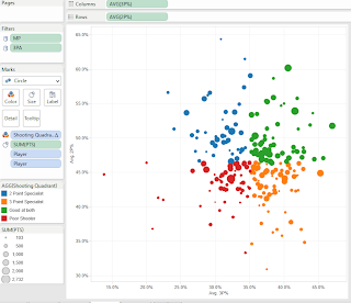
So I'm using window_avg calculated along Player. At this stage I then write a calculation to place each player into one of four groups depending on how they perform compared to the average, and place this calculated field onto colour to test its working:


Hitting the scatter plot icon on show me and then rearranging the fields a little results in this diagram, where you can clearly see the four quadrants:


Ok good. Now what I want to do is create an effect to show how far into each group each player is, so that players who are, for example,very deeply in the 3 specialist quadrant are represented in a darker orange. My inspiration for this idea came from Will Jones at Interworks who as far as I know was the first person to try dual axis colour http://www.interworks.com/blogs/wjones/2013/09/18/create-dual-color-axis-tableau

In my case I want to base the colour saturation on how far each player is from the overall mean in two dimensions, and so a bit of Pythagoras comes into play:


Then duplicate the rows and columns and make these dual axis, and synchronise the axes too. The key then is to make the top layer of scatter circles slightly transparent (around 70%) and then colour the bottom layer on a white to black scale based upon 'Distance from Centre', like so:


I changed the end point on the scale to account for outliers. Then add some reference lines for info and you are done! Here's what the finished product looks like, feel free to download and have a play,

Peter


Wednesday 20 November 2013

Things I've learned today about fonts.

When I first published the Tableau Viz below (DreamForce Tweets) it was heavily loaded with a font I liked that was pre-installed on my Windows 8 work PC called 'Script MT'. It looked like this:
And when I published the viz to Tableau Public, at first everything seemed fine. But I later realised that I was facing the familiar Tableau Public curse of your beautifully selected font not being compliant and so when viewed from other computers the font was reverting to Arial. I've had this happen to me many times before so decided to find out which fonts I CAN use.

This led me to this article http://kb.tableausoftware.com/articles/knowledgebase/resolving-font-discrepancy which states that because Tableau Public servers are installed on Windows 2008, only fonts that come packaged with Windows 2008 will work. So I picked one off this list http://www.microsoft.com/typography/fonts/product.aspx?PID=160 called Segoe Print. When I re-published my viz with this font everything at first seemed fine, and I checked on a different PC to double check. However I then loaded it up on my macbook:

PC Version

Mac Version


As you can see its not looking good on the Mac. And in both cases I'm viewing through Chrome. So I had a look for a list of fonts available on Mac and found this list http://en.wikipedia.org/wiki/List_of_typefaces_included_with_OS_X

So apologies if you are viewing my DreamForce viz on a Mac, its going to look a bit less exciting.

What I have learned? Well when publishing a viz on Tableau Public, the only way to be sure your fonts will render properly on all devices is to select from a very short (and boring) list of fonts like Arial, Veranda, Tahoma etc... Or be prepared to write everything out in Powerpoint and import words as picture files.

I think this is a real shame as Tableau allows so much freedom and creativity in so many ways - it would be nice if we could furnish our vizes with the fonts to match. I think there must be a way around this issue, and hope it is tackled at some point in future releases.

NB - Its worth noting this issue is only with Tableau Public, for a Tableau Server instance this is easily resolved by installing fonts onto the server machine.

DreamForce Tweets

(update - if viewing this on an Apple product, apologies for the poor looking fonts. See post above for explanation.)

 Last week I started working at Slalom Consulting - its early days but its been a great experience so far. There are many people from Slalom currently attending the DreamForce conference run by SalesForce.com. My colleague James Young had the idea of holding a mini competition to see who could come up with the best Tableau dashboard based on DreamForce tweets. Here's my entry, enjoy :-)


Monday 11 November 2013

Exquisite Viz Part 2: The results!

Here's how the Exquisite Viz turned out:


Not too shabby! There's lots to interact with in this 'exploration' type dashboard so please have a play.

(in case you missed it, here's how it started http://paintbynumbersblog.blogspot.com/2013/11/exquisite-viz-part-1-introducing-game.html)

Some notes:

When I received the viz back after it had gone around all the players and took a look at what they had each done, the difficulties that the rules impose became clear. I think this is actually a good thing as it forces you to think in new ways, but there are some tweaks I would consider making to enable the players to make more interesting and interactive vizes.


Because the initial rules did not allow for changes to be made on previous players worksheets, any dashboard actions that were added to work between sheets would only work if the fields had been used in both sheets. To get around this, Jewel broke the rules was smart and actually added some fields to previous sheets in the 'Details' shelf - the idea being that these would not impact the look of previous vizes but would allow actions to be built on a wider range of fields. Jewel's James Dean moment went a bit awry as it had a slight impact on Ramon's viz, but was a good idea and I think that for future games I would allow fields to be added to previous sheets as long as they have no impact on the view. I also learnt through this process that depending on the view used, adding dimensions to rows or columns and then hiding headers can sometime achieve 'no material impact' better than adding them to the details shelf as the latter will impact partitioning.

All participants responded positively to the game but they also had ideas after the viz was finished on how it could be polished to more of a finished product and here's what they thought of the experience and their contribution:

Ramon highlighted that here were many different ways to investigate the data, and so as the second player up he wanted to provide a different view to the first one:

"While Player 1's viz is showing the income gross of films breakdown by worldwide, domestic and foreign, with an interesting classification of movies according to endurance and local-global appeal, Player 2's viz highlights a different story grading the movies by profitability.

This viz allows us to recognize easily the top-n profitable films.....

There are many interesting stories, but we leave the viz to readers so that they explore by them self to find them."

Jewel found it an interesting challenge and also had an idea about how to improve the way in which the interactivity of the dashboard could be explained to the end user 

"Working with such a small quadrant was a challenge for me. I knew I wanted to make some kind of selector viz but it was hard to show all the categories I wanted to show; especially since I was trying to leave room for a few instructions. It might be a good idea for there to be a dedicated “help” menu that we can all add our instructions into; that way we don’t have waste precious space on explaining how to interact with our quadrants."

Carl I think had the hardest role going last

"I loved adapting to the colour schemes already available and then ensuring the bottom part of the viz worked as a unit as I couldn't find anything useful to fit the whole viz. Hence using genre as the colour still so it could interact with player 3.

I also enjoyed the limitation of being able to complete part of the overall. It made me think a lot more about what that one chart could add to the overall picture. 

It was also great to pick up after you guys so I could see a bit more about how you create your visualisations."

As for me, I found the process to be a really good learning tool as it allowed me to see how other people approach and construct their visualisations and I definitely took away some things I will use in future. I would love to do the whole thing again, but not go first, to experience for myself how tricky it is to build on someone else's work.

But all in all I thought this experiment was a success. It was really fun to do and I'd like to thank the three participants for their contributions and help in achieve this.

If anyone else tries an Exquisite Viz, I'd love to hear about it :-)

Peter


comments welcome.....


Friday 1 November 2013

Exquisite Viz Part 1: Introducing the game, the rules and the first workbook

Read to the bottom to see how you can take part #ExquisiteViz


Have you ever played that game where someone draws the head of a monster on a piece of paper, then folds it over and hands it to a friend who draws the body who then folds it again and hands it to the next person who draws the legs? Well that game, popular with 12 year olds and Surrealists alike, is called Exquisite Corpse http://en.wikipedia.org/wiki/Exquisite_corpse and results in things that look like this

 or this 
depending on your drawing ability!

Now this came to mind when I was recently trying to think of how to create collaborative work in Tableau without leading to the paralysis by committee, or individual takeover, that often occurs when you try to do group work. I also wanted to come up with something that could be achieved without all participants needing to be in the same place at the same time.  And so sprung forth the idea of EXQUISITE VIZ!

The aim of Exquisite Viz is to incrementally build a Tableau viz in a group of four by passing the workbook on to each player in sequence, who each add content in turn without deleting existing content. The idea is that this game like approach will allow a group to work together and learn from each other, with each group member having equal input. And it should in theory be fun too….


THE RULES OF EXQUISITE VIZ:

Number of players: 4
Start with:
-        A blank Exquisite Viz template. This template has four worksheets, one for each player and a dashboard sheet split into equal quadrants each containing the aforementioned worksheets, plus a title tile along the top and a text box for including names of players. Dashboard size is set to width 1000, height 800.
-        A single dataset, or combination of linkable datasets.


Step 1: Assign each player a number between 1 and 4.

Step 2: Player 1 starts the exquisite viz by:
-        Connecting to the data source.
-        Creating a single worksheet visualisation on the worksheet named Player1
-        Adding floating or tiled dashboard objects within the same quadrant on the dashboard
-        Player1 saves as a packaged workbook and emails to Player2.
Up to one extra worksheet can be used for additional dashboard objects if required, such as a shape based legend or help icon. But no more than one worksheet containing a chart or table can be added. And all sheets and objects must fit into the single quadrant.

Step 3: Player 2 then builds upon the exquisite viz by:
-        Creating a single worksheet visualisation on the worksheet named Player2
-        Adding floating or tiled dashboard objects within either quadrant 1 or 2 on the dashboard. Player2 can also move existing floating objects, as long as they stay within the quadrants 1 and 2.
-        If appropriate, adding dashboard actions to link the worksheets together.
-        Player2 saves as a packaged workbook and emails to Player3.
Player2 can move existing floating dashboard objects and can create dashboard actions that involve the Player1 worksheet, but CANNOT alter or delete objects and worksheets produced Player1.

Steps 4 and 5: Players 3 and then 4 take their turn at creating worksheets, adding actions and objects within the expanding work space on the dashboard. At each turn only addition and movement is allowed, deletion or alteration of existing material is not allowed.

Step 6: Player4 sends the packaged workbook back to Player1 who then adds a title to the dashboard and publishes.

Note: At any point, manipulation of data fields such as creating calculated fields, grouping, creating hierarchies, creating parameters etc… is allowed. Creating ‘design’ elements such as new shapes, colours or adding titles and fonts is also allowed. Filters can be applied but cannot be deleted.

Each step must be completed within 3 days of receiving the file.


THE FIRST EXQUISITE VIZ AND HOW YOU CAN TAKE PART

The idea of Exquisite Viz is so far just an idea, and it needs to be tested to see if it works well and to see what changes could be made to improve the experience.

The dataset we will be using is the Hollywood movie dataset that Information is Beautiful made available last year http://www.informationisbeautiful.net/2012/hollywood-budgets-a-data-viz-challenge/ which contains info like budget, ratings, box office takings and studio for every Hollywood movie produced between 2007 and 2011. This dataset is perfect because it quite broad, allowing for multiple approaches to analysis.

I have lined up the following players to take part in the first go around of Exquisite Viz:

Player 1: Me @pgilks
Player 2: Ramon Martinez @HlthAnalysis http://healthintelligence.drupalgardens.com/
Player 3: Jewel Lorée @jeweloree http://www.jewelloree.com/
Player 4: Carl Allchin @datajedininja http://datajedininja.blogspot.co.uk/

and I’ll be posting the results of our attempts on Nov 14th.

But you can have a go too! I have published the workbook up to Tableau Public, with the first quadrant completed. So please feel free to download this workbook, find a couple of friends to play with and have a go. Or if you like, ignore my first completed quadrant and do all four, its up to you!

Here’s the link: http://public.tableausoftware.com/views/ThefirsteverExquisiteViz/ExquisiteViz-MoviesDashboard?:embed=y&:display_count=no

If you do have a go, and I really would encourage you to, please let me see what you come up with by publishing the final results to Tableau public and then tweet about it with the hashtag #ExquisiteViz. I will post all entries up here along with our finished viz on Nov 14th.


Cheers!

Peter